Dashboards vs. reports: A comprehensive guide for data analysis
No doubt, clearly monitoring performance and communicating results is not a nicety, it’s a necessity. This is where data visualization tools like dashboards and reports usually come in handy. They essentially can help you transform raw data into clear and understandable formats. But with two powerful yet pretty similar options at your disposal, choosing the right one can sometimes be confusing.
This blog post will shed light on the key differences between dashboards and reports, helping you pick the perfect one for your data visualization needs. We’ll also discuss when to use each option and which tools can be helpful for creating dashboards and reports.
Disclaimer: This article was initially drafted using SE Ranking’s AI Writer. However, some parts of the text were written from scratch and the content has undergone thorough revisions, editing, and fact-checking by human editors and subject matter experts to ensure accuracy.
Key Takeaways
- Dashboard is a visual summary of important data points that allows for quick monitoring and informed decision-making. It typically shows real-time or near real-time data that is highly interactive.
- Report is a comprehensive analysis of data presented in a structured format, often focusing on a specific time period or topic. Reports can cover broader timeframes and include more complex data, but they are generally less interactive than dashboards.
- You can use dashboards to continuously monitor the progress of different campaigns, collaborate with clients in real time, and identify issues as they arise.
- Reports are commonly used to provide comprehensive updates to executives, communicate progress to clients, and share information across departments.
- Some of the most popular tools for creating reports include SE Ranking, Looker Studio, Power BI, and Google Analytics 4.
What are dashboards?
Dashboards are digital data visualization tools that display important information in a concise and easy-to-understand format. They typically use visuals like charts, graphs, and numbers to present key metrics or data points. Dashboards are designed to provide a quick overview of a particular subject area.
One of the key benefits of dashboard reporting is that dashboards are perfectly suitable for everyday analytics and business intelligence (BI) needs. In particular, BI dashboards offer a powerful way to consolidate, analyze, and present information from multiple sources, giving you a unified, accurate view of the bigger picture in seconds.
SEO teams can use dashboards to keep a pulse on organic traffic, identify keyword ranking shifts, and track backlink profile changes (for example, if any links were lost). Sales reps can monitor daily sales figures, leads generated, and conversion rates by channel. Finally, customer support gets a clear view of open tickets, resolution times, and agent activity—all crucial for immediate action and problem-solving.
What are reports?
Reports are detailed documents that present information in a structured format. Unlike dashboards, reports are more in-depth and can explore a wider range of information. Most often, they include background information, explanations of data analysis, and conclusions drawn from the data. Reports are typically generated at specific intervals, such as weekly, bi-weekly, monthly, or quarterly.
To illustrate how reports can enhance workflows, let’s consider the SEO, sales, and customer support cases we discussed earlier.
Using reports, SEO teams can identify their top-performing content, understand user behavior patterns, and conduct historical analyses of competitor strategies. In turn, sales teams can leverage reports to identify trends in sales performance. For instance, by analyzing data segmented by region, product line, or customer type, they can determine areas of strength and weakness. Similarly, customer support teams can use reports to track customer satisfaction over time and analyze the most frequent customer issues.
To sum up, reports provide a historical perspective and quick-to-understand forecasting insights, which is essential for analyzing the overall business performance and predicting future trends.
Dashboards vs. reports: Key differences and similarities
Dashboards and reports, while serving distinct purposes, share some key similarities. At their core, both are communication tools designed to present information in a clear and concise way. They achieve this by utilizing data visualization elements like charts, graphs, and sometimes tables to make complex data more easily digestible. This visual presentation allows users to quickly grasp trends, patterns, and specific metrics at a glance.
Yet, there are several significant differences between these visualization tools. Let’s explore them in detail.
High-level overview vs. detailed analysis
Dashboards are quick summaries that give you the most important information that is updated on the fly, making them great for monitoring key metrics and strategic KPIs. Reports, however, focus on specific questions and provide a deeper analysis. Using them, you can discover the underlying reasons behind trends or patterns in your data.
For example, a website traffic dashboard might show you total visitors and bounce rate, but a website traffic report would break down visitor demographics, traffic sources (like organic or paid search), and user behavior on specific pages. With these business insights at your disposal, you’ll be able to make data-backed conclusions on how to tailor your marketing strategies to attract the right audience and keep them engaged.
Real-time insights vs. historical analysis
Dashboards prioritize real-time insights. They continuously update with the latest information, which allows users to identify immediate trends and make adjustments on the fly. For instance, if a particular ad campaign isn’t generating clicks, a marketer can use the dashboard to see which demographics are least receptive and adjust the targeting accordingly.
Reports, on the other hand, focus on historical analysis. They present data over a specific timeframe and, therefore, enable users to compare past performance and identify patterns. Reports are often used for tasks like evaluating sales performance over a quarter, analyzing customer demographics over a year, or understanding website traffic trends over the past month.
Interactive vs. static data presentation
Usually, dashboards are designed to be highly interactive. In most cases, you’ll be able to click on charts and graphs to see the relevant data in more detail. This allows you to explore specific data points that pique your interest. Additionally, dashboards often come with filters that let you narrow down the information displayed.
For instance, if a sales dashboard shows overall revenue, you might be able to filter by product category or region to see how specific areas are performing.
Reports, at the same time, are generally more static. They present the information in a predetermined format, similar to a printed document. While some reports might offer limited sorting or filtering options, they typically don’t allow for the same level of exploration as dashboards. This static nature makes reports well-suited for scenarios where a clear and concise presentation of data is the primary goal, such as formal presentations or historical data analysis.
Use cases for reports and dashboards
Now, let’s take a look at the most common scenarios where dashboards and reports prove to be the most valuable tools.
Let’s begin with dashboards. They are commonly used for:
- Continuous Progress Tracking. Since most dashboards deliver constantly updated data on project KPIs, you can regularly monitor progress towards your goals—whether you check daily, hourly, or on your own schedule.
- Real-Time Client Collaboration: By granting your clients secure access to project dashboards, you automatically break down information barriers and build stronger relationships with them. This transparency allows clients to see progress firsthand, ask informed questions, and participate in discussions to refine strategies as needed.
- Proactive Issue Detection. Dashboards function as early warning systems. By displaying trends and data fluctuations, they can flag potential problems before they escalate. For instance, a sales dashboard showing a sudden decline in a specific region will surely require a deeper investigation. This may, for example, reveal a competitor’s new marketing campaign. With this knowledge, you can develop a counter-strategy to mitigate losses.
Here are some more examples of suitable use cases for reports:
- Executive Reporting. Using reports, you can deliver clear and concise summaries of critical data points to leadership. The thing is, reports can transform complex information (like monthly sales figures, marketing campaign effectiveness, and annual financial performance) into easy-to-understand snapshots. These insights empower executives to make data-driven decisions that drive company growth.
- Client Progress Updates. By delivering clear, concise reports that showcase your progress, highlight key metrics, and demonstrate the ROI you’re generating, you keep clients informed and validate the value you bring to their projects.
- Interdepartmental Communication: Regular reporting (monthly/quarterly) fosters alignment by providing a transparent view of overall organizational performance. By seeing the big picture, teams can identify opportunities to leverage each other’s strengths and adjust their efforts to seamlessly support the shared goals.
Best solutions to create dashboards and reports
Fortunately, there are numerous tools and platforms available to help you create both dashboards and reports.
SE Ranking
Considered one of the top SEO reporting tools, SE Ranking’s Report Builder allows agencies and in-house SEO teams to collect and present actionable insights to clients and/or colleagues with ease.
Whether you prefer complete customization or a jumpstart, SE Ranking offers both:
- Tailored Reports: Customize every detail to perfectly match your client’s needs and branding.
- Pre-Built Templates: Save valuable time by using 12+ pre-designed report templates that cover key SEO metrics.
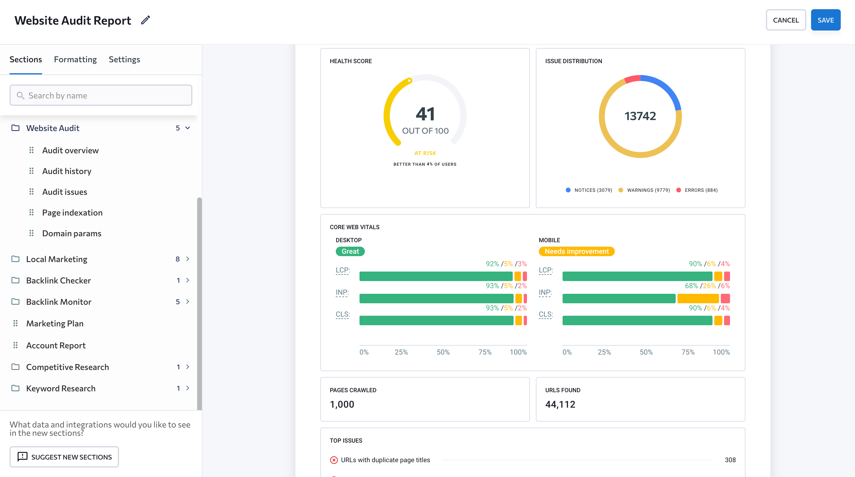 title=”SE Ranking Website Audit Report”
Need to include website traffic, conversions, or other business metrics? SE Ranking integrates with Google Search Console, Google Analytics, and even Matomo Analytics to provide a holistic view of your SEO efforts.
For clients who prefer Looker Studio dashboards, SE Ranking offers seamless integration. The team has developed four pre-built templates (Rankings, Site Audit, Competitors, and Backlinks) allowing you to deliver data in a format your clients will love.

You can either send SEO reports directly to clients, or grant them access to different types of dashboards within the platform. Besides, SE Ranking offers an Agency Pack specifically designed for agencies, which includes features like unlimited automated reports, a White Label feature, a Lead Generator, an Agency Catalog, and additional client seats.
Looker Studio
This free tool from Google is a great option for beginners and seasoned data analysts alike. Looker Studio offers a user-friendly interface for creating visually appealing dashboards that connect to various data sources like Google Search Console, Google Analytics, BigQuery, Google Sheets, YouTube Analytics, and Google Ads. It’s perfect for collaborating with colleagues and sharing reports easily.

With Looker Studio Pro (paid version of the tool), you’ll be able to create a team workspace to share reports, set permissions for different roles, control access to data sources, and automate report delivery. What’s more, Looker Studio Pro users can now view reports in a mobile-friendly format and collaborate on the go with the new Looker Studio mobile app.
Note: If you’re just beginning with Looker Studio or want a refresher on best practices, our SEO-focused Looker Studio tutorial will guide you through setup, customization, and reporting essentials before you dive into using templates.
Power BI
Power BI is a powerful business intelligence platform that caters to a wider range of data analysis needs. It excels at handling large datasets and offers advanced features for data manipulation and visualization. Power BI dashboards may feature different types of visuals, both built-in and through extensions on Microsoft AppSource. These include classic charts like bar and line graphs, as well as more unique options like maps, funnels, and even custom visuals you can design yourself.

While it has a bit of a learning curve, Power BI is a popular choice for businesses that require robust reporting and in-depth data exploration.
Google Analytics 4
Google Analytics 4 (GA4) transforms website and app data into clear reports, revealing crucial details about your business. From user behavior and performance metrics to their entire digital journey, Google Analytics paints a comprehensive picture. The data starts flowing in real-time after setup, giving you a constant pulse on user activity.

GA4 provides high-level strategic dashboards displaying key metrics like total revenue, user acquisition by channel (organic search, paid ads, social media, etc.), and overall conversion rate, alongside tactical dashboards that let you compare data across timeframes, user segments, and devices.
Dashboards vs. Reports: Choosing the Right Option
Dashboards and reports are not mutually exclusive; rather, they complement each other, providing strategic insights through charts and tables.
Both data visualization options offer unique advantages. Dashboards provide real-time, interactive data visualization, while reports deliver in-depth, structured analysis. Combining both creates a comprehensive view of your data, enabling you to make well-informed decisions that drive your business forward.