The definitive guide to mobile SEO: mastering optimization for mobile devices
As search engine algorithms continue to evolve, staying informed and adapting accordingly become increasingly important. Two noteworthy updates in July 2019 and June 2021 have significantly reshaped the landscape of SEO, stressing the importance of mobile optimization.
In July 2019, Google switched to mobile-first indexing. This has since revolutionized the way websites are evaluated for ranking. The Google of today uses the mobile version of a webpage as the primary reference point. If content is not accessible on mobile devices, it runs the risk of being overlooked in search results.
As if the prior update wasn’t game-changing enough, Google introduced another update in June 2021. Known formerly as the Page Experience update, this update places a strong emphasis on Core Web Vitals, which are a set of metrics that gauge the crucial aspects of a website’s performance. Some examples include page loading speed, interactivity, and layout stability.
Welcome to our mobile SEO guide, where we explore why mobile SEO is so important in today’s digital landscape. This guide contains all the insights you’ll ever need to create exceptional, mobile-friendly web pages that captivate both users and search engines alike.
The definition of mobile SEO
Mobile SEO is the practice of optimizing websites to ensure they perform at their best and provide excellent user experience on mobile devices. This technique involves a range of strategies and approaches tailored to address the unique characteristics and constraints of mobile devices. It encompasses website design, structure, content, and functionality, ensuring they meet the expectations and requirements of mobile users.

The goal of mobile SEO is to create a seamless and intuitive browsing experience that captivates users, encourages engagement, and drives a variety of desired actions. These could include conversions, purchases, or inquiries. Some of the key elements and best practices of mobile SEO include:
- Responsive web design: Ensure that your website automatically adjusts its layout and content to fit different screen sizes and resolutions. This provides a seamless user experience across devices.
- Mobile-friendly design: Optimize the website’s structure, fonts, buttons, and navigation to ensure it is easily readable and usable on smaller screens.
- Page speed optimization: Enhance your mobile page speed by optimizing images, reducing server response times, leveraging browser caching, and minifying CSS and JavaScript files.
- Mobile-optimized content: Ensure that your content is accessible and readable on mobile devices by crafting concise headings, shorter paragraphs, bullet points, and clear CTAs. This improves readability on smaller screens.
- Mobile keyword research: Conduct keyword research specifically for mobile search intent and optimize your content with relevant, mobile-focused keywords.
- Mobile-specific metadata: Craft concise and compelling meta titles and descriptions to capture attention from users on mobile search results pages.
- Mobile site indexing: Ensure that Google has properly indexed the mobile version.
- Local mobile optimization: This technique is essential for local mobile search, especially for businesses with physical locations. It involves maintaining consistent and optimized NAP information across local search directories and platforms to improve your business’s visibility and reach.
- UX optimization: Prioritize user experience by minimizing intrusive interstitials or pop-ups to ensure your site maintains a smooth scrolling and pinch-to-zoom functionality.
- Mobile analytics and monitoring: Use analytics tools, like Google Analytics, to gain insights into user behavior, bounce rates, conversions, and other key metrics.
Implementing these practices will play a key role in enhancing your website’s mobile performance. It will not only lead to a seamless user experience but also improve your search engine rankings in mobile search results.
The importance of mobile SEO
With the exponential growth in the number of people who use mobile devices, prioritizing SEO for mobile has become a no-brainer for businesses and website owners. Here’s why.
People spend most of their internet time on mobile
According to statistics, mobile devices account for over 58% of global website traffic. Additionally, search engines like Google prioritize mobile-friendly websites in their search results to ensure an optimal user experience. Studies have shown that 74% of users are more likely to return to a mobile-friendly website, underscoring the significance of SEO for mobile in capturing and retaining user attention.
To further illustrate the impact of mobile optimization, consider the following examples: ecommerce websites that offer seamless mobile shopping experiences tend to witness higher conversion rates and increased sales. In fact, 70% of consumers admit that page speed and website optimization play a defining role in influencing their willingness to buy from an online retailer.
It’s also true that local businesses with mobile-optimized websites are more likely to attract customers who are searching for products or services on the go. Statistics show that 61% of mobile searchers are more inclined to contact a local business that offers a seamless mobile experience.
Even content-driven platforms, such as news websites or blogs, thrive when their content is easily readable and accessible on mobile devices. This leads to increased engagement and sharing among users.
Google uses mobile-first indexing
Mobile SEO’s importance has also skyrocketed due to Google’s adoption of mobile-first indexing. This approach recognizes the increasing prevalence of mobile browsing and aims to ensure that search results cater to the majority of users accessing the web through mobile devices.
The importance of Google’s mobile-first indexing for mobile SEO is reflected in its direct impact on a website’s visibility and rankings. Websites that are well-optimized for mobile devices are more likely to achieve higher search rankings and attract organic traffic from mobile users. On the other hand, websites that overlook mobile optimization may experience a decline in visibility and lower rankings, leading to missed opportunities to reach and engage with the mobile audience.
The difference between mobile and desktop SERPs
Understanding the disparities between the mobile and desktop versions of the SERP is crucial for your mobile SEO strategy. The mobile SERP has distinct differences, such as a vertical and scrollable layout, which requires websites to present content that is concise, well-structured, and easily scannable. Optimize your mobile content for these metrics to capture users’ attention quickly.
Mobile SEO also places emphasis on creating mobile-friendly designs and responsive layouts that adapt seamlessly to different screen sizes, ensuring optimal display and usability on mobile devices. It’s also the case that optimizing page loading speed, leveraging mobile-responsive designs, and ensuring smooth navigation are all essential aspects that contribute to user experience on the mobile SERP.
The localization aspect of the mobile SERP highlights the importance of local SEO in mobile optimization. Mobile users often conduct location-based searches, including “near me” queries, as they look for immediate solutions or nearby businesses.
How to create a mobile-friendly site
In the early days of mobile Internet, it was common to create a separate version of a website on the m.domain.com subdomain, specifically tailored for mobile devices. This approach was necessary due to limitations in CSS functionality, making it challenging to optimize a single page for different screen types and sizes simultaneously. Some large websites adopted this strategy to evenly distribute traffic and alleviate the workload.
But despite its benefits, this approach poses challenges for SEO. Google treats subdomains as separate entities, potentially impacting the promotion and visibility of such pages. While exceptions like m.youtube.com still exist for standalone products exclusively designed for mobile devices, subdomains have still managed to maintain a strong backlink profile despite Google’s general stance on them. Unless your circumstance is unique like YouTube’s, it is advisable to avoid using subdomains for mobile versions of websites.
Mobile and responsive web designs now surpass the use of m.subdomains by offering a single website that seamlessly adapts to different screen sizes and resolutions. This eliminates the need for maintaining multiple versions of the site and ensures a consistent user experience across devices.
Mobile-first design
Websites with a mobile-first design prioritize the mobile experience, ensuring that it is seamless, user-friendly, and optimized for smaller screens and touch interactions. During the website design process, mobile users are placed at the forefront, and their unique needs and preferences are considered. This is how websites craft interfaces that are intuitive, easy to navigate, and visually appealing on smaller screens.
Getting a site’s mobile-first design right requires taking several key steps. Designers also need to have a thorough understanding of their target audience and their mobile browsing behaviors. By using this information, designers can cater the content and its functionality to mobile devices. This means focusing on crafting concise and easily accessible information. Responsive design techniques, such as fluid grids, flexible images, and media queries, can be leveraged to ensure that the website adapts seamlessly to various screen sizes.
Designers also need to pay attention to touch interactions and provide clear and intuitive navigation for mobile users. Thorough testing and optimization across multiple devices and platforms are crucial to ensuring a consistent and user-friendly experience.
Responsive design
Responsive design enables websites to dynamically adapt and adjust their layout, content, and functionality, providing an optimal viewing experience across various devices. Instead of managing multiple versions of a website for different devices, this approach allows for a single codebase and content management system.
There are several key elements to responsive design. The first involves using a fluid grid system. Fluid grids are essential to responsive design because they allow elements to be resized proportionally based on screen size. This ensures that the layout remains flexible and adapts to different devices.
Flexible layouts that use percentage-based widths and flexible images also contribute to the responsiveness of the design.Media queries play a vital role in responsive design by applying CSS rules based on different screen sizes and resolutions. By utilizing media queries, designers can customize the website’s appearance and behavior for specific breakpoints, ensuring optimal viewing and interaction on each device. For example, properties following the request below will only be applied to screens up to 600px wide.
@media only screen and (max-width: 600px)
And don’t forget about JavaScript! If your site includes JS scripts, it’s important to add the appropriate events for mobile devices. For example, the standard mouseup event will not function on mobile since there is no mouse to click. Now, the phone screen can be touched, so you should implement the equivalent for mouseup, which is touchend. Be sure to replace mouseup with touchend wherever mouseup was used.
How to check if your site is mobile-optimized
Now that we know what mobile optimization is, let’s look at some ways to check if your website is truly optimized for mobile devices. Tools like Google Search Console, PageSpeed Insights, or dedicated SEO platforms like SE Ranking, can provide valuable insights and analyses. This includes your website’s mobile-friendliness, page loading speed, and overall mobile optimization. We will take a look at each of these tools in greater detail in the next section.
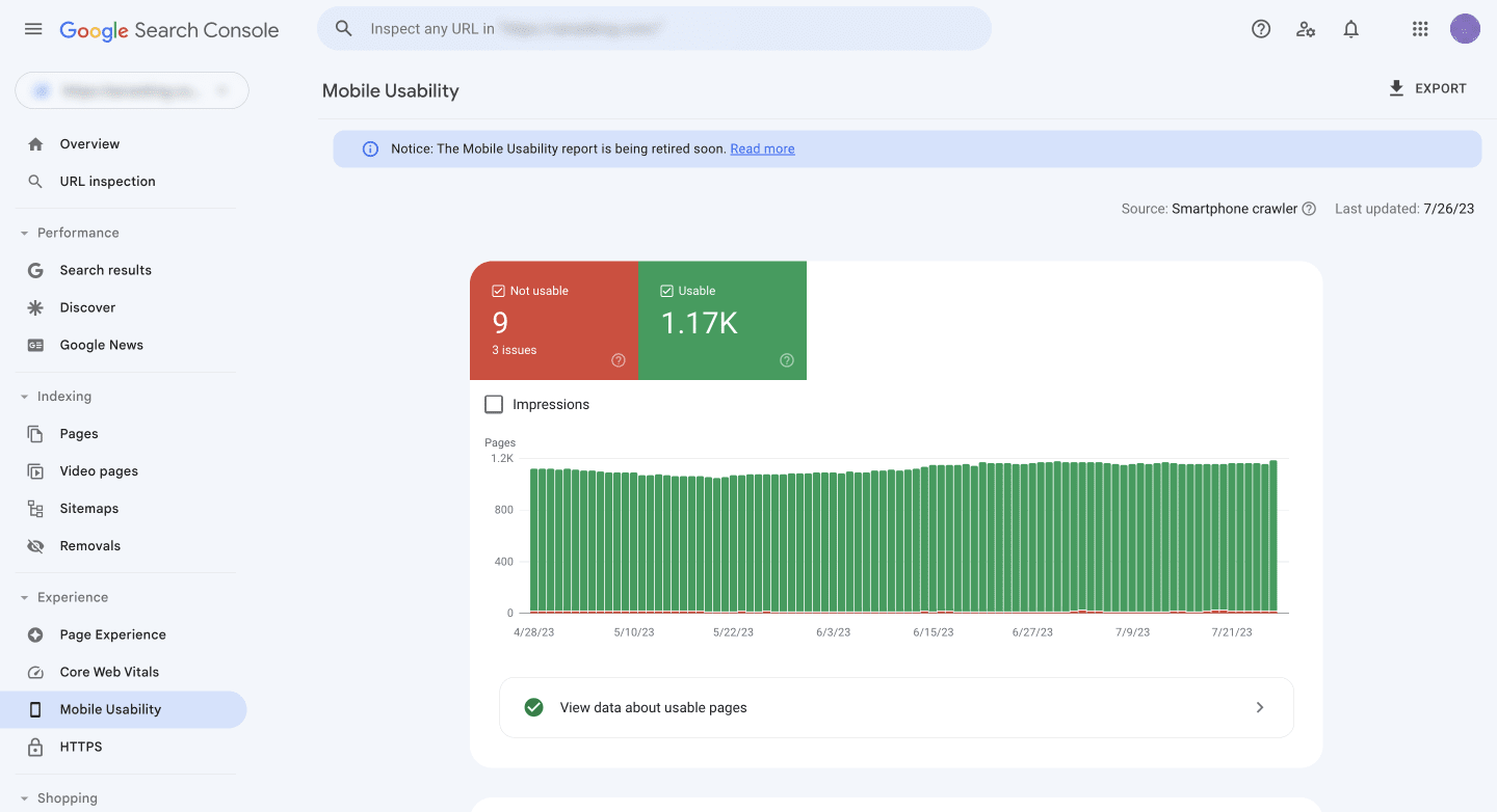
Last December, Google decided to retire the “Mobile Usability” report in Search Console, along with the Mobile-Friendly Test tool and Mobile-Friendly Test API. But despite these changes, this doesn’t diminish the significance of mobile usability for achieving success in Google Search.
Google Search Console
Google Search Console serves as a powerful tool, providing tons of valuable data and insights to help you gauge your website’s performance on mobile devices. GSC lets you track mobile-specific search performance metrics, including impressions, clicks, and average position in mobile search results.
Google Search Console’s Mobile Usability report offers a comprehensive overview of all mobile usability-related issues detected on your website. It identifies specific pages that may have problems, such as content not properly sized to the viewport, clickable elements being too close together, or viewport configuration issues.
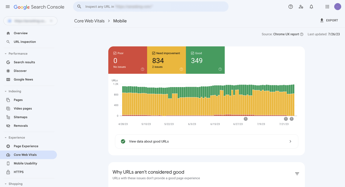
The Mobile section of the Core Web Vitals report in Google Search Console is another exceptional tool for gauging mobile effectiveness. It provides valuable metrics related to page loading speed, interactivity, and visual stability on mobile devices, including Largest Contentful Paint (LCP), First Input Delay (FID), and Cumulative Layout Shift (CLS). These metrics provide insights into your website’s overall performance and user experience on mobile platforms.
Mobile-Friendly Test Tool
Mobile-Friendly Test tool is another valuable resource to assess the mobile-friendliness of your website. Just enter your website URL into the tool and it will quickly evaluate its mobile compatibility.
The tool provides results that include a screenshot showcasing how your page appears on a mobile device and highlights any mobile usability errors that need to be addressed.
PageSpeed Insights
The PageSpeed Insights tool is another valuable resource. Google created it to help users evaluate the mobile-friendliness and optimization of their website. Similarly to the previous tool, just enter your website URL into the tool, and it will provide detailed information and performance metrics about your site to help you assess your website’s mobile performance.
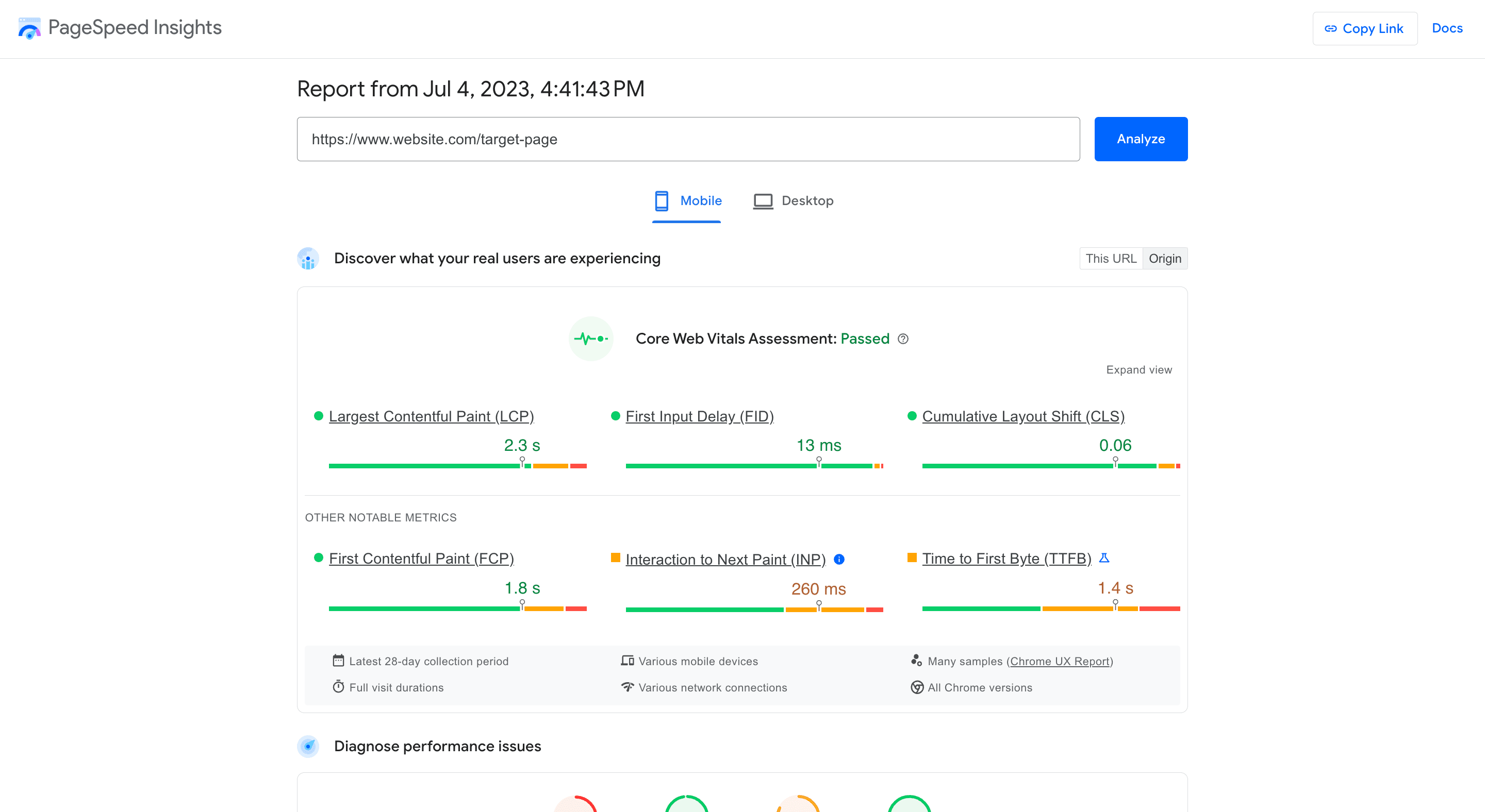
PageSpeed Insights provides a performance score along with metrics such as Largest Contentful Paint (LCP), First Input Delay (FID), Cumulative Layout Shift (CLS), First Contentful Paint (FCP), Interaction to Next Paint (INP), Time to First Byte (TTFB). These metrics help you evaluate loading speed, visual stability, and the overall user experience on mobile devices. The tool also provides specific recommendations and opportunities for improvement, such as image optimization, leveraging browser caching, or minifying code.

PageSpeed Insights even displays screenshots of how your web page loads on mobile devices so you can see how well it performs. This visual aspect allows you to identify potential issues related to rendering, layout, or content visibility.
Lighthouse
Lighthouse, a Google Chrome extension, is another great tool for evaluating website performance, including mobile usability. Just like PageSpeed Insights, it gives you valuable insights into loading speed, interactivity, and visual stability. By leveraging Core Web Vitals, it helps fix issues that impact the mobile user experience.
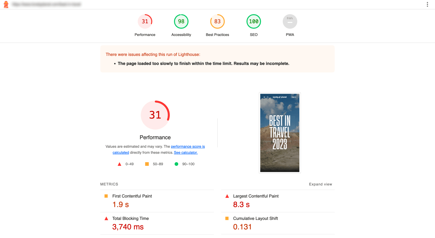
With Google retiring the Mobile-Friendly Test tool and others, Lighthouse steps up as a powerful alternative. Its comprehensive evaluation capabilities, actionable insights, and alignment with Core Web Vitals make it perfect for assessing mobile usability.
SE Ranking’s Website Audit tool
SE Ranking is another valuable resource for checking your site’s mobile optimization. In the Website Audit report, head to the Issue Report section to get valuable insights into specific pages with mobile optimization problems.
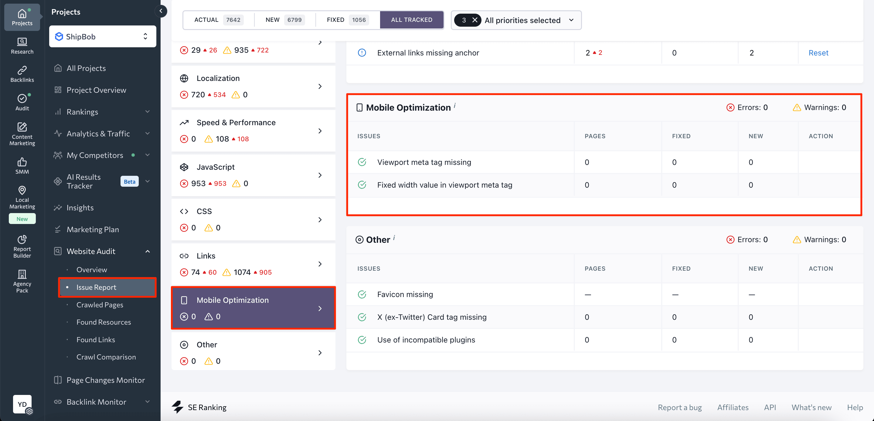
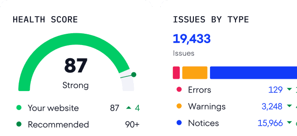
You’ll find the site’s health score and Core Web Vitals measurements, all graded from critically bad to needing improvement and good. This helps in pinpointing and addressing issues at a granular level.
By enabling regular automatic audits, SE Ranking keeps you in the loop, quickly detecting potential optimization problems. This means that you can set up the tool to regularly and automatically assess your website’s mobile-friendliness and optimization. It provides up-to-date information and alerts for any emerging issues. By leveraging the insights and recommendations provided by SE Ranking, you can level up your website’s mobile optimization, enhance user satisfaction, and improve your rankings.
Useful mobile optimization tools
Here are some handy tools and browser extensions that can assist you in your mobile SEO efforts:
- Chrome Inspector: This handy tool lets you emulate device screen sizes, giving you a visual preview of how your pages appear on popular smartphones and tablets. It also helps you check font and background color contrast for improved readability.
- WP-Optimize (WordPress): A highly regarded WordPress plugin that focuses on boosting website load speed. Activate its features to significantly enhance your website’s performance on mobile devices.
- Lazy Load (WordPress): A simple yet effective WordPress plugin that uses lazy loading technology to speed up your website’s loading time by deferring the loading of images and media until they are needed.
- WP Rocket (WordPress): One of the most popular paid WordPress solutions for comprehensive website load optimization. It offers advanced features and optimizations to improve your website’s mobile performance greatly.
- Jetpack (WordPress): This powerful suite of tools offers mobile optimization features like lazy loading and responsive images, perfect for enhancing your WordPress site’s mobile performance.
- AMP (WordPress, Drupal, and Shopify): Implement Accelerated Mobile Pages (AMP) for faster loading and an improved mobile experience.
- JTouch (Joomla): Enhance your Joomla site for mobile devices with a mobile-friendly template and responsive design.
- Mobile Joomla! (Joomla): Automatically detects and optimizes your Joomla site for mobile devices, providing a user-friendly mobile experience.
- Mobile Friendly (Drupal): This module provides responsive design options and mobile detection features to optimize your Drupal site for mobile devices.
- Wix Mobile Editor (Wix): Use Wix’s built-in mobile editor to customize and optimize your website’s design specifically for mobile devices, ensuring a responsive and mobile-friendly layout.
- Magento Mobile Shop (Magento): Create a mobile-friendly version of your Magento store with responsive design capabilities to enhance the mobile user experience.
Looking to build a mobile-optimized site with a simple structure? Learn how to make single-page websites SEO-friendly.
Mobile SEO Best Practices
When you’re optimizing your website for mobile devices, there are some important things to consider. The recommendations provided by Google are a great starting point, but we’ll dive into other mobile SEO tips to improve your site’s mobile-friendliness, user experience, and search engine visibility.
If your server is slow, no other improvements will help. Take care of this first.
Compare desktop vs. mobile behavior
Take a look at how visitors behave on your desktop and mobile sites. Look for differences in user engagement, conversions, and bounce rates. This data can provide improvement insights and help you tailor your mobile strategy accordingly.
Test across devices and browsers
Check your website on different mobile devices and browsers to ensure everything works smoothly. This will help you identify and fix any layout or functionality issues and provide a consistent experience across platforms.
Check out our guide about picking an SEO-Friendly theme for your business. Then pick the one that suits your business best!
Optimize mobile speed and Core Web Vitals
Speed is vital for mobile. Optimize your website for fast loading times and pay attention to Core Web Vitals metrics to create a seamless mobile experience. Use caching techniques (which reduce server requests) and load pre-rendered HTML documents to improve overall speed. Minify CSS and JS files by removing unnecessary characters, such as spaces and tabs, to significantly speed up page loading. Tools like freeformatter.com can assist with this process through Lazy Loading, which is a smart way to load images gradually as users scroll. It reduces initial screen loading time and improves LCP measurements.
Implement user-friendly navigation
Make sure your navigation is easy to use on mobile devices. Create a simple navigation bar and clickable elements. Prioritize the most important links and information for mobile users. Ensure interactive elements like buttons, text entry fields, checkboxes, links, and more, are large enough for users to easily hit them with their fingers.
Use flex or grid layout
Flex layout is great for moving blocks that exceed the container to a new line, making it perfect for the mobile version. Simply set the width of the container and the float element correctly. Flex containers also let you change the order of items inside them.
The Grid layout, as the name implies, turns the container into a grid. You can set the number and size of columns and rows in the table. For mobile devices, you need to adjust these parameters to adapt the view to a smaller screen (for example, go from 4×2 to 2×4).
Use Schema markup
Rich search results already support over 30 different types of content. If your page matches one of those types, use the Schema.org markup to appear in related blocks in search results.
Optimize Title tags and Meta Descriptions for mobile SERPs
Create compelling and concise title tags and meta descriptions for mobile search engine result pages (SERPs). This optimization boosts click-through rates and drives targeted traffic to your mobile site.
Create mobile-friendly content
Craft content optimized for mobile consumption. Use shorter paragraphs, bullet points, and concise headings to make it easier for users to skim and read on smaller screens. Ensure multimedia elements like images and videos are optimized for mobile devices.
Image size can be compressed without compromising dimension or quality. You can use tools like TinyPNG to compress images. If for some reason you still use Flash, immediately abandon it. Flash is not supported anymore and simply does not work.
Also, work on content accessibility. Ensure the text color is different enough from the background, so users can easily read it. You can measure the contrast level in the browser by hovering over the text color in the Chrome Developer Tools console. For large text elements like headings, aim for a contrast of more than 3, and for the rest, more than 4.5. Since font size should not make the text difficult to read, it should be no less than 14-16 pixels.
Be mindful of pop-ups
Pop-ups can be annoying for mobile visitors, so ensure that they are not obstructing the main content or negatively impacting the user experience. Try slide-in banners or in-content offers as alternative strategies to avoid intrusive pop-ups.
Optimize for local search
If your business has a physical location or serves specific geographic areas, optimize for local search. Use local keywords, optimize your Google My Business listing, and provide relevant and accurate information for local users.
Monitor keyword positions on mobile
Keep track of your keyword rankings on mobile devices. Mobile search results may differ from desktop, so monitoring your mobile SEO performance helps you identify more mobile SEO opportunities. One great tool for tracking your progress is SE Ranking’s search engine rank checker.
Conclusions
Mobile SEO is essential for most websites, offering substantial benefits for SEO and conversions. The good news is that it’s not too complicated. Numerous solutions are available to make the mobile optimization process easier. Just follow Google’s recommendations and use these solutions to enhance your website’s mobile performance, unlocking its full potential for reaching and engaging with mobile users.