Trust Factors for Ecommerce Websites

Written by
Dmytro Davydov
Jul 05, 2022
40 min read

Categories of products and services, shop address, contact and delivery information, FAQs, and other ecommerce page elements help strengthen user trust. Surely, you have noticed these elements when looking for new sneakers or a language course.

In this article, we will closely examine trust signals, why they are essential for ecommerce websites, and how they help increase website authoritativeness and boost conversion rate. 

What are trust factors, and how do they affect rankings

Trust factors are a set of website features that affect user trust and the convenience of making a purchase or ordering a service. Trust factors are an important signal for most search engines.

Google uses the E-A-T concept to measure website quality. E-A-T stands for Expertise, Authoritativeness, Trustworthiness:

  • Expertise. The content is created by a competent professional author with a proven notable reputation. The search engine must contain information about the author’s expertise. For example, blog posts, mentions, etc.​
  • Authoritativeness. The content is located on an authoritative domain with a good reputation. The authoritativeness score is usually assessed according to external signals: links to your site from other resources, mentions, and reviews.
  • Trustworthiness. The content is credible, accurate, and valuable to the user. Secure HTTPS protocol, detailed information about the company, and reviews on other reputable sites also signal trustworthiness.

Google considers these three parameters when evaluating the quality of search results. What this effectively means is that they can directly affect the page’s position in SERP.

The E-A-T quality is crucial for YMYL sites. YMYL stands for “Your Money or Your Life,” meaning resources that can affect site visitors’ well-being, health, financial stability, and security. Medical resources, financial organizations, online stores, and news portals are often considered YMYL resources. Occasionally, Google checks such sites to ensure that users can trust them. Therefore, the owners of YMYL sites should pay extra attention to trust signals.

Let’s explore the main trust factors. Notice that the listed factors won’t suit every page—you should consider the page type when selecting the ones that fit it best. For example, a product’s categories block will be of no use on a medical services website but will work perfectly on an online store. So, read carefully and choose the right parameters for your business.

Contact information

It is impossible to imagine a website without a detailed contact information box. The exact address, map, phone numbers, and photos of the office—all these factors give visitors confidence in a company and its products or services. At the same time, they increase page authority in the eyes of search engines. Below, we provide a detailed review of the different types of contact information page elements along with examples of how they work best. 

Contact information in the header and footer

Phone number

The very fact of having a phone number up on a website has a positive effect on potential clients. They understand that, if necessary, they can contact a manager and quickly resolve an issue.

The phone should be in a prominent place; for example, in the header. That way, users do not have to dig through the site to find it.
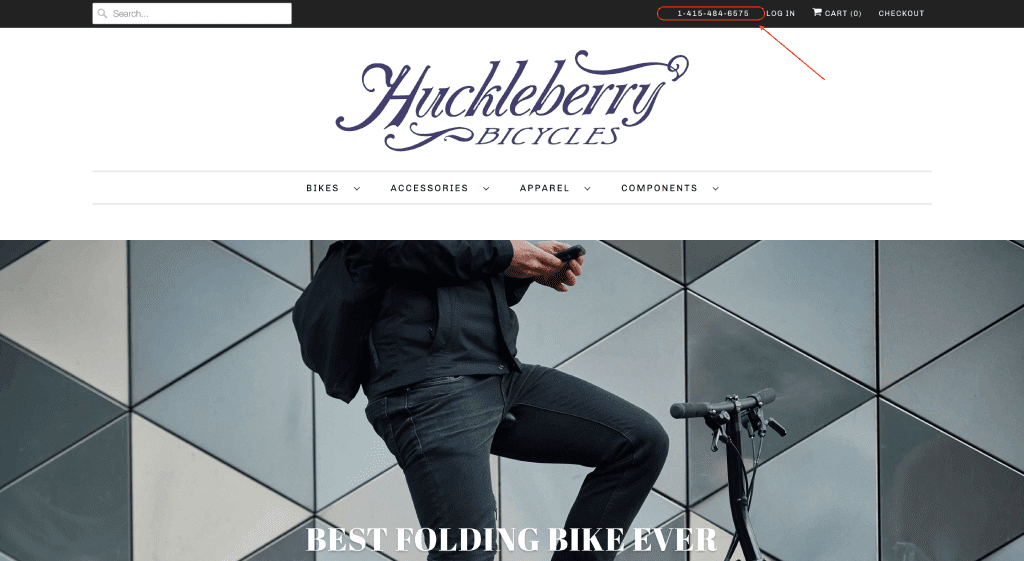
Example of a phone number in the header

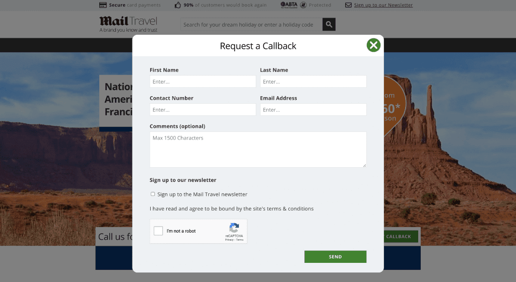
A callback button could be placed near the phone number. Upon clicking it, users can enter their name, phone number, and select a convenient time for the manager to get back to them.

You can add such forms to your site by using an HTML code script or purchasing a ready-made widget.

Example of a request callback form on the ecommerce website

Here are some tips you should follow when adding a phone number to the header:

  • Indicate a local phone number if your business operates in several regions
  • Use a toll-free phone code, for example, 0120, 800, 0800, 888, 877, 866, 855, 844
  • Use both mobile and landline numbers
  • Add the “tel:” HTML tag to make the number clickable and allow users to call immediately instead of entering numbers manually
  • Implement call-tracking to evaluate the effectiveness of advertising campaigns
  • Use the international number format: +1-212-456-7890

Address and working hours

Don’t forget to add information about your working days and office hours when adding a phone number. Otherwise, an unanswered call outside of business hours can irritate a potential client and even lead to a lost sale.

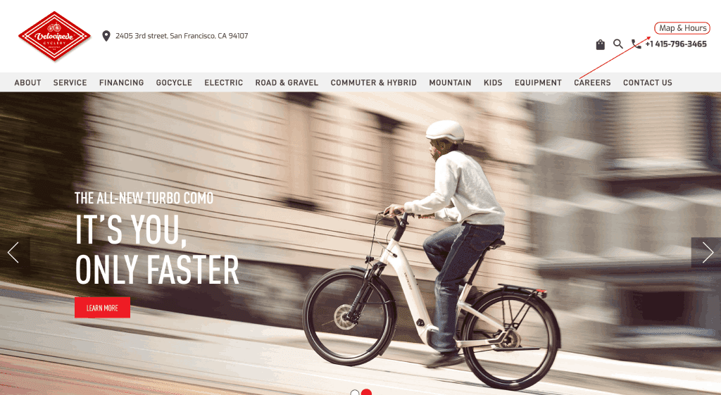
Address and working hours information in the header

Don’t hesitate to add address information if your business has a physical location. For example, include this information in the website header if you have several locations or offices. This will help potential clients easily find the address without going to the Contact Us page.

However, users often deliberately scroll down and look for contact information in the footer. For this reason, be sure to provide enough information in every necessary place.
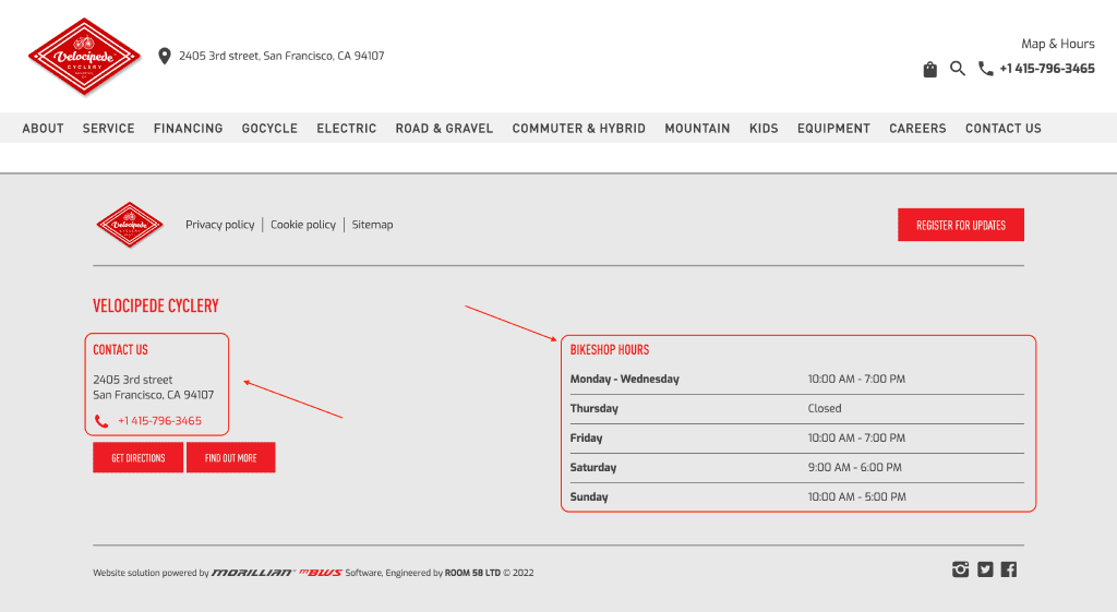
Address and working hours information in the footer

Contact Us page

Contact Us page in the main menu

Now, let’s move on to the Contact Us page, which is essential for promotion. The page with detailed contact information and a request form should be easy to find and not force the user to jump through any hoops. Therefore, don’t forget to place a link to the Contact Us page in the site’s main menu.

Company name

Contact information is crucial and should not be underestimated. Provide your company’s full name as indicated in legal documentation.

Company address

We recommend indicating the legal as well as all physical addresses that may be useful to your customers: offices, warehouses, pick-up points, etc. This will ultimately help users be aware of your local presence.

Information about company addresses in the footer

Address on the map

Using an interactive map instead of a static image to display your location is always a good idea. Also, you can group locations in clusters or regions to allow for easier searching. Finally, we recommend adding a photo of the building entrance along with directions on how to get there.

This will help users clearly understand the location and how to get there without contacting the manager directly. Embedding a map on your site can also increase the trustworthiness of your website and reduce the bounce rate. It will also help you retain visitors on the site instead of redirecting them to third-party resources.

There are several ways to embed a map into a website. For example, find the address of your company on Google Maps, click the “Share” icon and select “Embed a Map”. Then, select the size, copy the iframe HTML and paste it into the page code. You can also consider other methods, for example, API.

Phone numbers

Add phone numbers to the page. For example, if you use several phone numbers for different departments or regions, group them and make appropriate headings. You can also specify the responsible managers and add their names along with photos here.

Example of phone numbers in the footer

Email address

Email remains the most important communication channel. Create emails with your site’s domain. For example, [email protected]. Don’t use free email services like @gmail.com, as they reduce user trust. Also, designate specialists for different pages and add their email addresses. 

Example of email addresses in the footer

Feedback form

The feedback form facilitates communication between companies and their clients. Without feedback forms, users will have to send out emails, which could be uncomfortable for some users. Instead, they can enter their name, email address, and text of the message into respective fields of the feedback form and click the send button. As a result, all messages will go directly to the company inbox. 

Also, feedback forms can serve as an anti-spam measure. For example, Captcha is a special code that should be inserted into an additional field. Without it, the letter will not be sent. And since such security codes are displayed on images, they can’t be copied by bots. What this ultimately means is that only letters submitted by real people will come to your mailbox.

There are several ways to add feedback forms to sites: from universal PHP scripts to plugins and CMS modules, for example, WordPress.
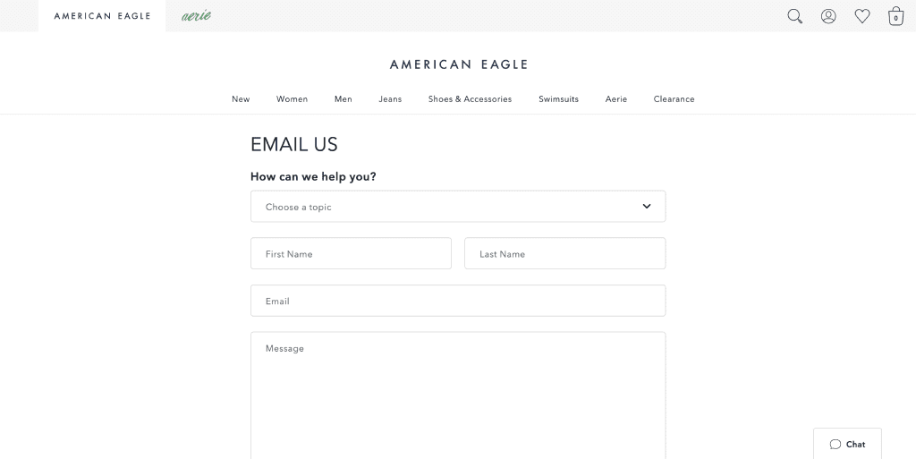
Example of a feedback form on the ecommerce website

Company details

Add all legal and banking details to the Contact Us page to increase trust from both the user and search engine perspectives. For example, indicate the organization’s legal name, address, registration, and banking details, as well as shipping and payment information. Note that this information should be written as text, and not as a picture or file. This way, users and search engines can scan and copy the data.

Social networks

Social media networks are vital for any online business. Corporate profiles on Instagram, LinkedIn, and Facebook increase user trust and allow them to follow company news.

Include links to your social media accounts in the footer and Contact Us page. Moreover, ensure that such links are active, and allow users to immediately go to the page upon clicking on the icon.

Links to social networks in the footer

Messengers for communication

Some users prefer communicating via instant messengers, like Facebook Messenger or WhatsApp. Communication via messengers proves that your business is ready to help clients at any time. So, it could be a good idea to include these communication channels on the site, either in the header, footer, or on the Contact Us page. Remember that most messengers have widgets that can be easily added. 

Online support

The online support widget is a popular solution on many ecommerce websites. It allows users who may feel uncomfortable to call in personally to get a quick response to a question. 

Online support helps boost conversions, increase user loyalty, collect additional data about potential customers, and identify issues that prevent users from converting. This feature can also improve website behavioral metrics. For example, the total time on the site can increase as well as the number of internal cliсks.

Online support often looks like a button at the bottom of the page that opens up a small chat pop-up window when clicked on. This button should not overlap the content or interrupt the user experience on the site. Instead, the chat window should be small, no more than 500px in height and 340px in width.

A human manager can also answer calls, but a chatbot can automate user communication. Unlike human managers, chatbots can provide support 24/7.
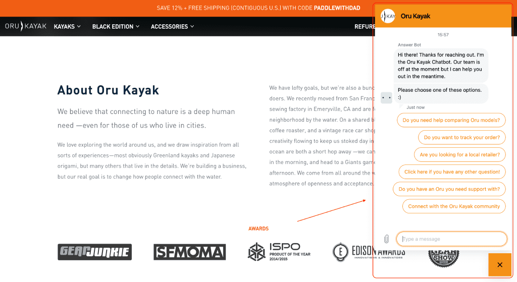
Example of an online support chat on the ecommerce website

Company information

Detailed information about the company is a must-have component for all online businesses. A short description of the company history, its goals, achievements and success stories, customer reviews, and information about employees improves the user experience, increases their loyalty, and signals the authority and trust factor to search engines. So, let’s explore some elements you should consider adding to your site.

About Us 

Users often visit the About Us page to get more information about a business.
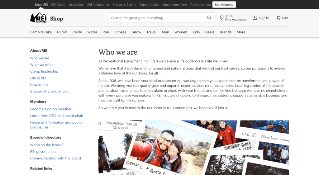
Example of an About us page on the ecommerce website

Here are some ideas on what can be mentioned here:

  • Advantages. Mention something that makes your products and services outstanding and unique, describe your experience, and add information about your suppliers.
  • Achievements. People prefer specifics, so share facts and information, especially if you have something to brag about.
  • Recognition. If you have any awards, rankings, certificates or diplomas, why not show them? Either place a picture of them on your site or add a link to the page with more information. Don’t be shy as this goes a long way.
  • Mission statement. Add information about the brand’s goals to help users understand the company’s approach to customers, recognize its uniqueness, and ensure that the brand’s mission resonates with their own.

This information can also help improve brand awareness for your potential employees. So, don’t hesitate to describe the benefits of working at your company, for example, free training courses, health insurance coverage, gym access, and so on. Instead, share some photos of the office or the team and add reviews about your experience working for the company.

Don’t underestimate the About Us page. It is useful even in terms of link-building. So, it is crucial to provide complete, accurate and reliable information about the company on your site.

Employees

Users want to know the faces behind the business. To help them do this, it’s a good idea to share photos of your team or at least show some key employees along with a brief description of their experience to increase user trust.

Example of the information about employees on the ecommerce website

News

If your business produces news that is important and useful to your audience, add this section to your site. That way, you can inform potential customers of the latest news, new products, events, promotions, and anything else that may be of interest to them. And also:

  • News demonstrates that the company keeps developing and actively conducting various activities. This builds up trust among users and signals to search engines about new pages.
  • Well-configured linking between pages helps promote essential pages.

You can place a link to the news page in the header/footer or display news on the site’s main page.

Example of a News page on the ecommerce website

Blog

The blog is another vital section of a company website. And here is why:

  • The blog is the easiest way to demonstrate your expertise. You can share tips or guides to help users solve widespread problems.
  • Blog posts increase website traffic. The B2C Content Marketing research indicates that a section with supplementary information increases reach by 64%. Articles should be optimized for target keywords to appear at the top of the search results.
  • You can link blog posts to product pages or services descriptions to increase the website’s conversion rate.
  • The blog can be used to establish contact with customers. Regular publication of interesting and helpful content contributes to the growth of loyalty.

To maximize the benefit of your blog, add new articles regularly. Also, consider creating useful materials on the topics that can help your audience and demonstrate your expertise: white papers, research, guides, ebooks, etc. Make this content unique and structured, plus remember to add pictures, graphics, or illustrations. 

Also, let users comment on your blog posts. This allows for better engagement with your readers and will enable you to better understand their needs and requests.

Example of a Blog on the ecommerce website

Reviews

The Reviews page demonstrates that your products are used by real customers and meet their expectations. This helps build trust and confidence among potential clients and encourages them to buy from you.

There are several ways of designing a reviews page. You are at liberty to include:

  • Reviews from customers along with their name, photo, company and position
  • Screenshots of direct messages or emails
  • Social media posts and comments
  • Videos with customers reviews 
  • Links to special review platforms and similar resources

Think about integration with Google Business Profile or Google Maps because reviews on third-party resources are more trustworthy

Consider adding filters to structure the information if you offer many products or services. This way, your customers can select to view the reviews that matter to them most.

Example of reviews about the company

As we’ve mentioned, consider giving your users an option to leave reviews. The most common way is a particular feedback form, but you can also send out newsletters via email or messengers. Another way is the star rating of products—it is much quicker and simple for users to share their experiences.

To motivate your users to leave reviews, consider rewarding them by offering gifts, giveaways, or engaging them in other activities. 

Consider launching a bonus system. Reward users who leave reviews with bonuses that can be applied to future orders. This way, you will get valuable feedback from potential customers and encourage current customers to reorder.

Publications

The page with publications helps users and search engines understand that you are a trustworthy company that is mentioned by other authoritative sites.

If a well-known media outlet makes a publication about your business, don’t hesitate to share it with your website visitors. Indicate the media, publication title and date, and don’t forget to add a clickable link to the original publication so that visitors can go and read the publication.

It is best to create a separate page for such publications. But you can also add a similar block to the main or About Us page.
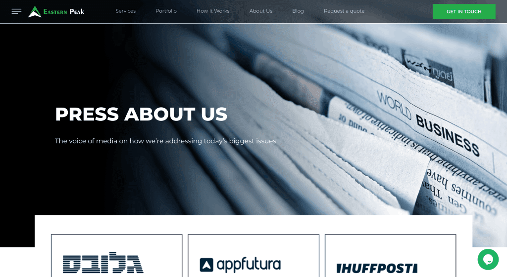
Example of a Publications page on the website

Portfolio

If you offer any products or services, make sure to demonstrate your best works. The portfolio reflects your expertise and allows converting visitors into potential clients.

The portfolio design, type, and content depend on your industry. Describe the project, goals and tasks, timeline, work process, and include customer feedback. If you wish to display multiple projects, divide them into categories. 

Example of a Portfolio page on the ecommerce website

Certificates

If your site sells products, consider adding documents and certificates that confirm their quality. That way, you can significantly increase user trust in products and the website in general. And if you provide services, certificates can prove your expertise and encourage users to consider your business for potential engagements.
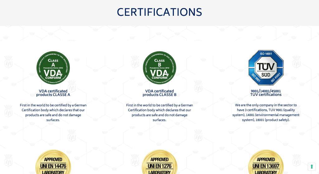
Example of a Certifications page on ecommerce the website

Awards

Any awards, recognitions, or rankings can have an extremely positive effect on your reputation and increase the trust. After all, don’t you want people to know that you are the best? 
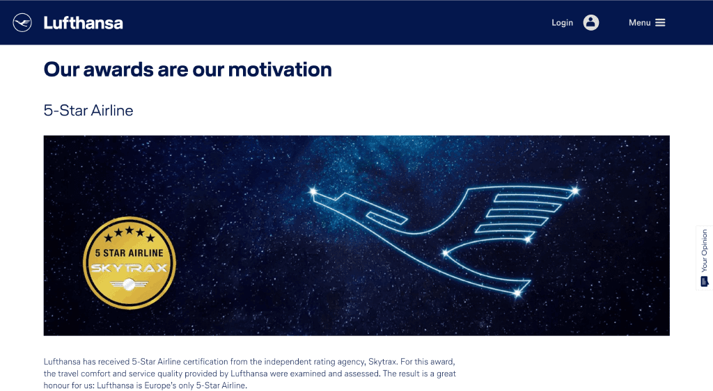
Example of an Awards page on the ecommerce website

Cooperation

If you are willing to work with large clients, implement bulk orders, build long-term partnerships, and provide products or services under special conditions, let users know about it; create a page with information about the cooperation.

Affiliate marketing has become quite popular. This is a marketing channel in which an affiliate company or person promotes your products or services by advertising and driving traffic to your site or selling them directly, and gets a reward or a share from the sales. 

Attracting potential affiliates is not hard at all. Create a dedicated page for potential affiliates where they can learn about your products, conditions, and prospects of cooperation. And don’t forget to leave the contact information of the responsible affiliate manager, who can explain it in detail. 
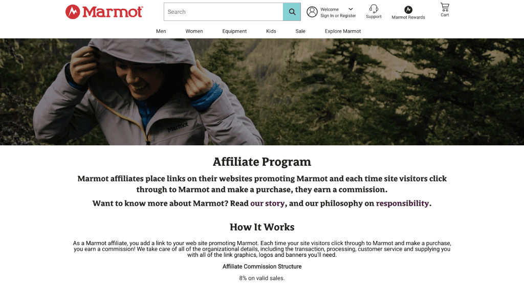
Example of an Affiliate program page on the ecommerce website

Google Business Profile

Google Business Profile presents an opportunity to get traffic and promote your business. This free tool allows displaying basic business information on Google Maps. You need to indicate the company’s industry, contacts, website address, physical address, description of goods and services, and business hours. Of course, be sure to add photos of the location and products.
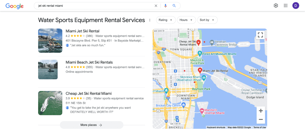
Google Business Profile in search results

Business Profile allows local customers to find your business. This service also allows tracking comments and responding to them. With this information, you can adjust your business according to customers’ reviews and requests while, at the same time, increasing their loyalty and trust.

Vacancies

Frequently, companies use specialized third-party sites to publish announcements about new vacancies and find new employees. But it makes sense to duplicate this information on your own site. This can emphasize that the business keeps growing and yields additional interest in the company. 

This page should include:

  • Your brand philosophy—company values, mission statement, benefits for employees
  • A list of vacancies—position, description, primary duties and conditions

Of course, add a phone number and an email address that can be used to contact your HR department. 

Example of a Careers page on the ecommerce website

Catalog

The main section of any ecommerce website is the catalog. Search engines analyze catalog structure, variety of assortment and other marketing aspects. But first, special algorithms assess the convenience of purchasing from the catalog and its relevance to users. 

Let’s examine the most essential elements that should be included in a product catalog. 

Assortment

The variety of products should meet users’ expectations. But, of course, it depends on the business niche. For example, users expect to see several different models of smartphones in an online electronics store. And if the assortment is too small, it would look suspicious, and the users will most likely close the site and search for another one with a relevant product selection. On the other hand, if users are looking for a diamond drill, just a couple of options would be enough, considering the fact that drills are not the most popular product on the market.

All in all, users shouldn’t hesitate with regard to the product assortment because any doubts can affect the trust.

Navigation

Navigation in the catalog should be intuitive and convenient to users. The main categories should be visible and accessible, including on mobile. The path to subcategories should be well thought out and structured.

For example, let’s take a look at Amazon. We see every popular category on the homepage. By clicking on one of them, we find ourselves on a page with products and subcategories.

Catalog navigation on the ecommerce website

Search

Search can facilitate and speed up the transition to necessary pages, improve the user experience, and increase conversions. Make sure the search mechanism on your site works properly and that potential customers can easily find relevant results on a well-designed page. 

Also, ensure that search engines access and index product pages correctly so that they don’t compete for traffic among themselves, especially if you own an aggregator.

Example of internal search on an ecommerce website

Filters

Filters help users quickly find necessary products based on specified parameters. On top of that, filters can generate new landing pages, which is vital for SEO. 

Often, filters are located on the left-hand side of the page. Add parameters that can be useful for site visitors. For example, if you sell bicycles, you can have the following filters: brand, price, frame size, wheel diameter, number of gears, country of origin, color, and additional features.

Also, let users sort search results by rating, popularity, cost, and arrival time. The “Sort by” filter is usually located at the top of the search results page.

Search filters in the catalog

Preview

The product preview in the catalog should be as informative and as helpful as possible. Be sure to provide enough information for visitors to review the product without going to the product card and reading the full review. A full preview should become available when hovering over the block.

The product preview should depict the main parameters: price, characteristics, rating, and availability. Also, you can add special buttons, for example, to add the product to favorites, compare it with other similar products, or buy directly from the catalog page.

Preview of products on the ecommerce website

Favorites

Some orders are not carried out on the first visit to the site, especially if the product is expensive and the customer needs to weigh all the pros and cons. Therefore, it makes sense to allow users to save the product to favorites and return to it later on in the future. This feature helps optimize the sales funnel—the visitor is more likely to return to the site to continue the search or complete the purchase.

The “Add to Favorites” button is usually located near the “Buy” or “Add to Cart” buttons, both in the preview and in the product card itself.

Example of the Add to favorites button on an ecommerce website

Comparison

As mentioned before, purchasing expensive products or services often takes time and requires careful selection and comparison. Clients should always be able to compare different options and select the one that suits them most.

The “Add to Compare” button is usually located next to the “Add to Favorites” button in both the preview and the product card itself. Upon clicking, the user gets redirected to a page with the comparison of the parameters of the analyzed products, usually displayed in a table.

Example of the Add to comparison button on an ecommerce website

Availability

The availability of a product should be displayed both in the preview and in the product card itself. Otherwise, users may be unaware that the product is out of stock and will continue placing the order. Just imagine how irritated users get when it turns out that a product they spent time analyzing and comparing is currently out of stock. This definitely leads to a loss of trust.

Product availability information on an ecommerce website

If a product is, in fact, out of stock, it makes sense to allow users to leave their contact information and get a notification once it is available.

As a rule of thumb, products should be sorted in the list according to their availability. Products that aren’t available for ordering should be displayed at the very bottom of the list or not at all.

Product information

Product cards should be as informative as possible. In addition, you must provide a detailed product description to persuade users to evaluate it and make an informed purchase. 

Moreover, a detailed product description can positively impact the rankings of ecommerce sites. To ensure that search engines comprehend the product page correctly, the page should have a product-type markup. To boot, the markup can also increase the click-through rate and conversion rate.

Description

The description section of the product card is supposed to give users detailed information about the product or service. This is obvious. The more detailed the information is, the fewer concerns or questions the user will have. This is exactly why the description should reveal the main benefits of the offering and convince users to make a purchase.

Example of product description on an ecommerce website

Features

In the Features section, you should list all product characteristics. Specify as many product parameters as possible that may affect the customer’s choice. For example, smartphones have the following properties: operating system, color, screen size, built-in memory, battery capacity, etc. This helps users evaluate the product, understand its properties and make an informed purchasing decision. 

Another benefit of this is that users can filter or sort search results against different properties and quickly find the product they are interested in. 

Example of product features on an ecommerce website

It is best to put all properties together in a table so that the information is easier to perceive.

Price

Any potential buyer wants to have complete information about the product. And most of all, they are interested in the price. The price must be located both on the product card and the preview, where it is obvious and convenient to users. Your product page will look suspicious without a price, and you risk scaring away potential clients.

Websites operating in different regions or countries can show prices depending on the user’s location. In this case, you can place a currency sign next to the cost to make it more convenient and avoid misunderstandings. In addition, the visitor should be allowed to switch to a different currency.

Example of product price on an ecommerce website

Images

All products must be accompanied by high-quality photos, images or illustrations. Use several images or even 3D models to showcase products from all angles.

If possible, show how the product can be used. For example, demonstrate a shirt on a person so that users can understand how it will look on them.

Example of product images on an ecommerce website

Do not forget to optimize images before adding them to a page. Otherwise, the loading speed of your product pages may slow down, deteriorating the overall user experience and rankings. 

Also, keep in mind that the alt tag should also be specified as it tells search engines what is shown in the image. This allows pages to rank by images in the search.

Video

A video review is a great way of showcasing your product and highlighting its key features. For example, when potential customers have the opportunity to look at a product from all sides and see how it is being used, they are more likely to make an informed decision and purchase. 

Video content helps keep visitors on the product page and enables them to get more information on the product’s features and benefits. This, in turn, increases the conversion rate and allows the page to appear at the top of the search results for videos.

Upload video reviews to YouTube and add a link to the site page via an iframe.

Reviews

As mentioned above, customer reviews are crucial to users. Reviews from real customers can help potential customers better understand the product. Also, reviews improve behavioral factors, as they encourage users to leave their own comments or questions. 

At the same time, reviews, being user-generated content, can also affect rankings in search engines. If reviews are indexed, search engines treat them as part of the page, providing unique content and additional keywords that you may have missed. 
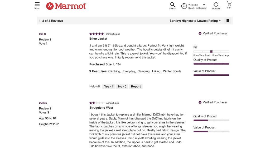
Example of product reviews on an ecommerce website

Product reviews are usually placed under the description and properties. For example, a “Write a Review” button, which takes the visitor to the review form, should be at the top of the reviews section. To make it easier for users, add the ability to authorize website access via social networks.

Also, consider allowing users to sort reviews by various parameters, such as by date, website rating, or the presence of a photo.

Rating

Encourage users to rate the product when writing a review. The product’s overall rating can be aggregated based on customer reviews. This can later be used as one of the filtering options. Sometimes, sites set their own ratings in addition to customer reviews.

Example of product rating on an ecommerce website

The rating is usually scored on a scale of 0 to 5, displayed as stars, and is often placed at the top of the page next to the number of reviews. More detailed rating information can be displayed below. This will give users a general idea of the product’s value without forcing them to read every review.

You can add the product rating to the search result snippet using schema markup to attract more visitors to your site. Along with the price and the number of reviews, it is one the most crucial parameters to display in the snippet.

Example of snippet with rating

Similar products

Similar products can be displayed at the bottom of the page. They are often automatically pulled from the category of the original product, not only is this important for demonstrating your attention to customers and suggesting analog products, but it’s also key for internal linking. This leads to an increase in the number of transitions to other pages as well as a higher conversion rate.

Similar products can be configured automatically in any CMS.

Example of similar products on an ecommerce website

Related products

This section is used for upsells. Here, users see products that can be purchased besides the main product. For example, in addition to smartphones, you can offer headphones, cases, cables, and other accessories.

Make sure not to abuse this block. Only relevant products should be added to this page element. Always analyze user needs and interests before adding products.

Example of related products on an ecommerce website

Viewed products

During user sessions, the product page can include a list of viewed pages. It is usually displayed as a slider at the bottom of the page. This feature improves the user experience and convenience of navigation as it allows users to quickly return to previously visited product pages.

The Viewed products block can be configured in a CMS using various plugins.

Buy button

A product is usually considered ‘purchased’ once the respective button has been clicked. The “Buy” button should be placed in a prominent place at the top of the page next to the price. Also, the button should stand out and be of bright contrasting color.

Pay attention to the text on the button. It must be straightforward and inviting. For example, instead of “Cart,” use “Add to Cart,” and instead of “Purchase,” use “Buy”.

Usually, there are two separate buttons: “Add to Cart” and “Buy in one click”. Users can decide which one to use depending on their intention to continue shopping or go straight to placing an order.

Example of Buy button on an ecommerce website

Checkout functionality

Placing an order is the final step of interaction between the user and the site. So, to make sure nothing prevents the visitor from completing the order, you need to think this process through, down to the smallest detail. Here are the main elements that should be present on your site.

Cart button in the header

The shopping cart should not be hidden somewhere on the page. Instead, the button should be placed in a prominent place, usually in the right corner of the header. For convenience, the number on the button should display the number of items added to the cart.

Example of Cart button in the header on an ecommerce website

Buy button in the footer

Some users scroll down the page to understand the product better and then decide. Scrolling back to the beginning may be inconvenient, so it makes sense to duplicate the buy button or the order form at the bottom of the page. Furthermore, an additional call to action will encourage the user to make a purchase.

Shopping cart

At this stage, the user is just one step away from the order. Once in the shopping cart, nothing should prevent them from making a purchase. The page should respond quickly, be intuitive, and meet the following requirements:

  • Users should be able to quickly return to the product page. By clicking on the name of the product in the cart, that product’s page should open in a new window
  • Users should be able to set the quantity of products in the cart
  • Users should be able to quickly remove added products
  • The checkout form should have as few fields as possible. A form with a vast number of unnecessary fields can scare users away
  • The cart should not reset once the site is closed
  • The cart should support registration via social media networks to save time
Example of shopping cart on an ecommerce website

Users may have to spend a lot of time on the page and enter a lot of information to submit an order. So, to make the shopping cart more user-friendly, the purchasing process should be structured and well-thought-out. For example, you can divide it into logical blocks: cart → delivery selection → payment method → order confirmation. Otherwise, users may leave the site without purchasing.

Track and analyze abandoned carts to better understand at what stage users leave the site and how the process can be optimized.

Buy in one click button

This feature allows placing an order almost instantly. In some cases, users can buy in one click using previously entered data instead of purchasing through the shopping cart and filling out dozens of fields. Also, users can enter a phone number and wait for a call from a sales manager to process and complete the purchase.

This feature helps users save time by reducing the number of required steps and shows that the business cares for its customers.

Additional information

Once users have selected a product, they will seek information about payments, shipping, returns, etc. In such cases, it is vital to have all this information available in detail so that users can get answers to all of their questions and continue shopping without having any doubts.

FAQ

FAQ is a separate page or a section on the page that contains answers to questions that are frequently asked by visitors. Not only does this help users find detailed information, but it also improves the SEO of a site by adding unique content with high-volume long-tail keywords. So, make sure to plan this section with extra diligence.

Example of an FAQ page on the ecommerce website

Consider all questions that your visitors may have. Pay attention to the “People also ask” and “People also search for” snippets in Google to find related questions and comments.

Then, write comprehensive and straightforward answers. Avoid typical responses from the Internet, and think carefully about your answers, especially if you work in a specialized niche. By the way, when preparing answers, don’t hesitate to use SE Ranking’s Keyword Research tool to find new keywords that can be used in FAQs.

Payments

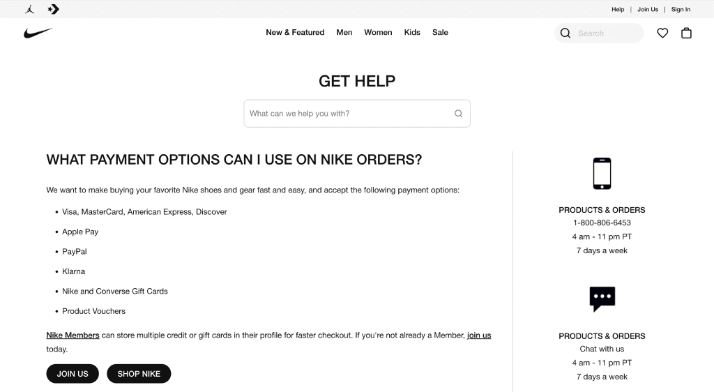
Information about payment options and conditions must be present on your site. The clearer and more detailed information you provide, the more reliable your site will be to users.

On the payment page, give detailed information about the payment methods, systems, and commissions, as well as safety and guarantees. Add the logos of available payment systems to product pages to save users’ time.

Example of payment information on an ecommerce website

Delivery

Delivery is an essential part of online shopping. A detailed description of the delivery terms helps potential buyers quickly understand at what price and how quickly the ordered product will be delivered. Besides this, delivery info is another way to increase trust in the business.

Write down all the terms of delivery in as much detail as possible. Here are the main points that should be revealed:

  • Delivery area. Whether you deliver worldwide or only serve your local community, users should be able to understand that the product can get to them.
  • Shipping options. Indicate all delivery companies that you use and all self pick-up locations. 
  • Cost. Write down the shipping prices or indicate that it is free. Indicate all additional costs that may be incurred.
  • Time. Add the approximate number of days for delivery. If you deliver at a specified time, add information about how users can set it.
  • Delivery features. Indicate all related service specifics. For example, point out whether it is possible to return the goods during fitting.
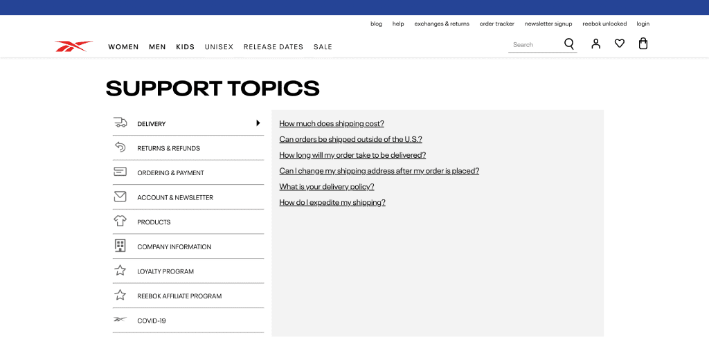
Example of delivery information on an ecommerce website

Warranties

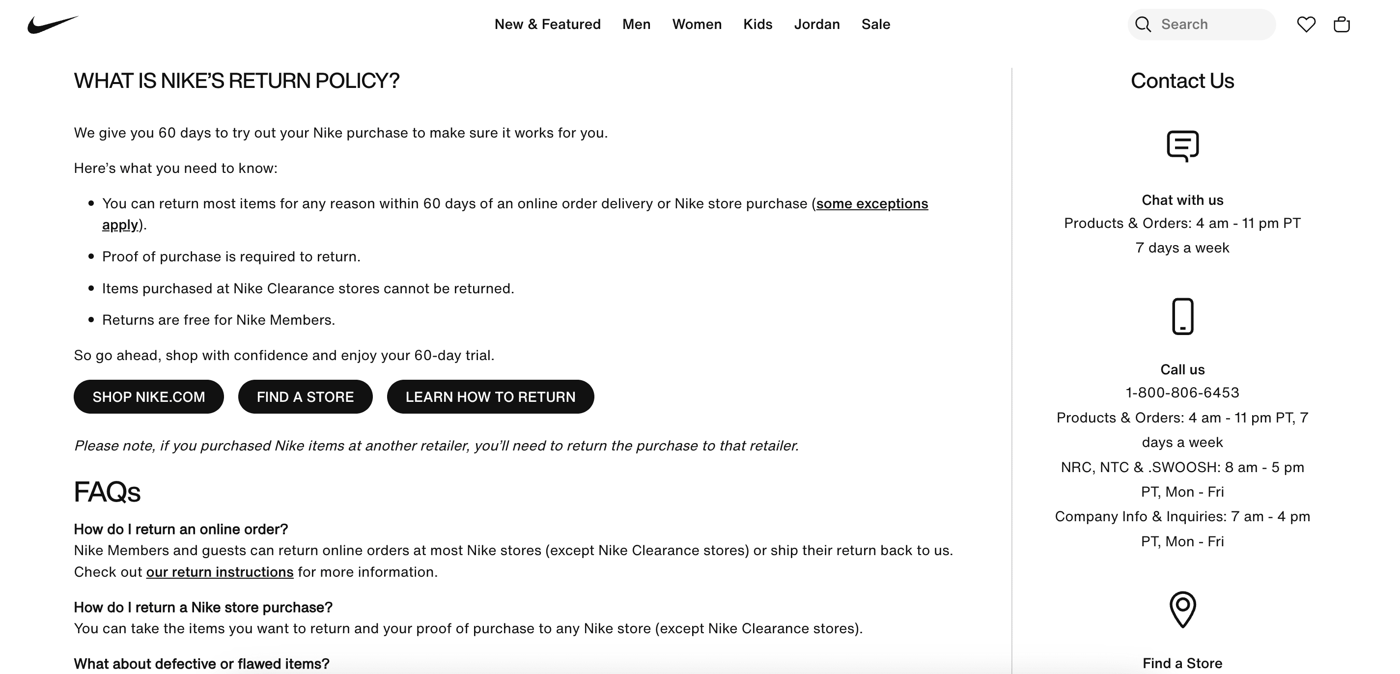
The warranties page or section should convey to customers the warranty terms and how the product can be returned if something goes wrong. Users should be aware of it before buying. Well-written warranties allow avoiding possible issues and demonstrate your care and reliability to customers.
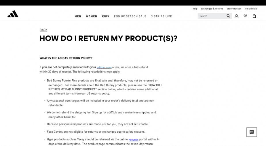
Example of warranties information on an ecommerce website

Inform site visitors about the possibility of returning the order, warranty conditions, and other relevant information. For example, electronics ecommerce websites should have information about the official warranty from the product manufacturer. 

Refer to the local laws that regulate warranties and other customer guarantees.

Promotions and discounts

No one can resist discounts when shopping. It’s just human nature. So, always inform users about all active discounts and promotions. Display this information in the product card, on the homepage, in the header and in the footer. However, if you frequently offer discounts on different products, maybe it makes sense to create a separate page for special offers.

Example of promotions page on an ecommerce website

Price calculator

The price calculator is primarily used on ecommerce websites that deal with individual orders. This interactive widget allows users to select multiple toggleable features which can increase or decrease the final price. As a result, users can quickly estimate the total spendings on products without having to call a manager. 

The price calculator can be added to a page using HTML or a simple plugin.

Legal documents

Just like any other business, online businesses operate within the law. Any ecommerce website must contain a package of legal documents in order to work officially. This package helps avoid fines and lawsuits. So, let’s take a look at the necessary documents for your site.

Privacy policy

The privacy policy clarifies everything related to collecting, processing and storing user information, transferring it to third parties, etc. This policy is essential for almost every site. It shows users that their data is appropriately used and protected by law.

Personal data includes name, address, date of birth, marital status, contact information, ID documents, financial records, medical data, history of visited places, intention to purchase goods and services, and other information that can be used to identify a person.

Read SE Ranking’s Privacy Policy as an example. 

Terms of use

Terms of use or user agreement is another essential document that can be found on most ecommerce websites. It defines the relations between the company and the site visitors who use it.

Terms of use contain the following sections:

  • User consent to the terms of use of the site
  • Disclaimer for the performance of third-party services that are used on the site
  • Disclaimer for misuse of services
  • User consent to accept provided services defined and limited by the terms
  • Distribution policy
  • Commentation policy
  • Rules for conducting promotions

This section may also contain other legal information, such as licensing and site owner information. Often, site owners use templates reviewed and approved by lawyers. 

Read the Terms of Use on SE Ranking’s website for reference.

Cookies

A cookie is a special file that contains a record of the actions a user performed on a site, such as adding a product to the cart or entering login information. The server saves and retrieves this information during subsequent visits to provide a better user experience.

Since cookies can be considered personal data, you can add this information to the Privacy policy. But it’s better to create a separate page with a brief description of the cookies, how the site uses them, and how this data will be treated. 

Also, most sites have a pop-up banner that asks users for their consent to use the cookies. 

You can embed a banner on a site using a CMS or other services, such as Cookiebot, CookiePro, or OneTrust.

Data protection

GDPR

The General Data Protection Regulation provides a unified approach to protecting the personal data of EU citizens. GDPR extends to all operations with personal data. Compliance with the GDPR is compulsory for any ecommerce website that either operates on the territory of the European Union or provides products or services to EU citizens, even if the business is not registered in the European Union. 

Websites must comply with the following principles:

  • Inform users about collecting, storing and using their personal data
  • Provide users with the information on the collected data upon request
  • Limit or delete users’ personal data upon request
  • Notify users about any data leakage

Penalties for violations of GDPR rules can be as high as 20 million euros (equivalent to 21 million dollars) or 4% of a company’s annual global revenue. Take a close look at the full text of the GDPR on the official website.

CCPA/CPRA

The CCPA is a California data privacy law, an American analogue of the GDPR. It gives California residents the right to request information about how their personal data is used and demand to delete it. The plan is that in the future, the CCPA will be extended and replaced by the CPRA (California Privacy Act).

These rules apply to all California enterprises, except for large businesses like Google or Amazon. Websites that fail to comply with the Act can get a penalty of $2,500. So, include information about compliance with the CCPA/CPRA in the Privacy policy. 

HIPAA

HIPAA, or the Health Insurance Portability and Accountability Act, is a US federal law designed to protect patients’ personal data. So, HIPAA rules may apply to hospitals, dental clinics, or other businesses that provide medical services. Non-compliance with HIPAA can result in fines of $50,000 and even criminal liability in some cases.

To comply with HIPAA, websites must meet the following requirements:

  • Patient information should be permanently removed from the server and database if it is not required anymore
  • Customer data must be backed up and restored in case of loss
  • An SSL certificate should be present to guarantee encrypted data exchange between the user’s browser and the site’s server
  • Additional data encryption services must be in place

Conclusion

Trust factors directly determine the overall quality of web pages and websites. To get top-ranking positions, you must effectively incorporate as many of them as possible. 

To recap:

  • Not only users but also Google pays a lot of attention to trust factors, especially on YMYL sites
  • Tell users about your business—create an About Us page, talk about your advantages, and mission statement, describe your achievements, and add certificates and diplomas
  • Contact information is essential. Make sure to indicate detailed information, address, phone numbers, social media accounts, etc.
  • Prove your expertise with a portfolio of your best works
  • Don’t forget about feedback—create a review form and an online chat to provide quick assistance to users
  • Keep a blog to share valuable insights and news about your company
  • Work on the product catalog, make straightforward navigation, and let users filter the results
  • Create detailed product cards with a description, main properties, photos, videos, and customer reviews
  • Work on the checkout functionality. Think every step through, from review to placing an order. Don’t forget to indicate the price, add the “Buy Now” button, and include the “Add to Favorites” and “Add to Comparison” features
  • Provide complete information about payment methods, delivery, returns, and warranty
  • Create an FAQ page to provide answers to the most common user questions
  • Keep legal documents in one place: privacy policy, user agreement, use of cookies

Take note of all of these trust factors and do your best to make sure your site’s got them covered. That way, you can ensure your site is convenient and valuable to users. Plus, it can get high-quality scores and rank high in search.

Subscribe to our blog!

Sign up for our newsletters and digests to get news, expert articles, and tips on SEO

Thank you!
You have been successfully subscribed to our blog!
Please check your email to confirm the subscription.