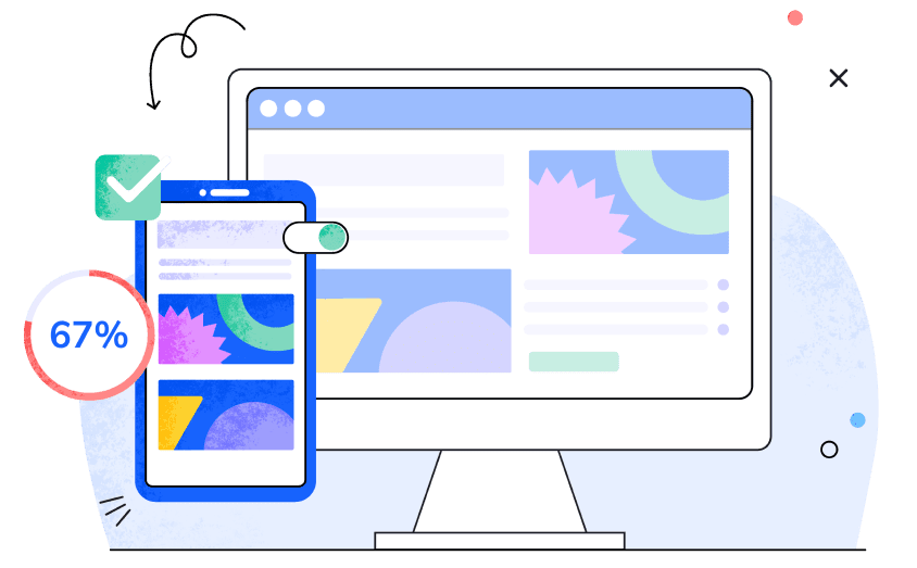
Mobile Friendly Site Test
Results

Your page needs improvements is mobile friendly
Mobile performance score
Other mobile-friendly test criteria:
Tap targets are properly sized and well-spaced
Clickable elements are too close together/Tap targets are too small
Description
Checks if any clickable elements (e.g., buttons or icons) on your page are smaller than the recommended 48 pixels
Recommendation
If the check is not passed, consider adjusting the margins or padding of clickable elements so that each element, including borders, is at least 48 pixels or large
Text on the page is easy to read
Text is too small to read/Text size is too small and hard to read
Description
Checks if the text on your page is smaller than the recommended 12 pixels, making mobile reading difficult.
Recommendation
If the check is not passed, increase the font size to at least 12 pixels for better mobile readability.
Content fits within the screen’s width
Content is wider than the screen/Content extends beyond the screen
Description
Checks if some page elements are wider than the device’s screen, making the content difficult to view and interact with.
Recommendation
If the check is not passed, ensure all width attributes are relative (≤100%) or their pixel width doesn't exceed the screen width.
Viewport is set correctly
Viewport meta tag is missing or incorrect
Description
Checks if your page's viewport meta tag is missing or incorrect, which may cause display issues on different mobile screen sizes.
Recommendation
If the check is not passed, add the correct viewport meta tag to your page's ‹head›: ‹meta name="viewport" content="width=device-width, initial-scale=1"›
How to use our Mobile Friendliness Checker
Using our Mobile Friendliness Checker is pretty straightforward. Enter your website's URL, hit the "Analyze" button, and let our checker do the rest. In just seconds, our tool will evaluate your site's mobile-friendliness for key technical (page speed) and usability (viewport settings, text size, touch elements, and on-screen content) factors for both users and search rankings.
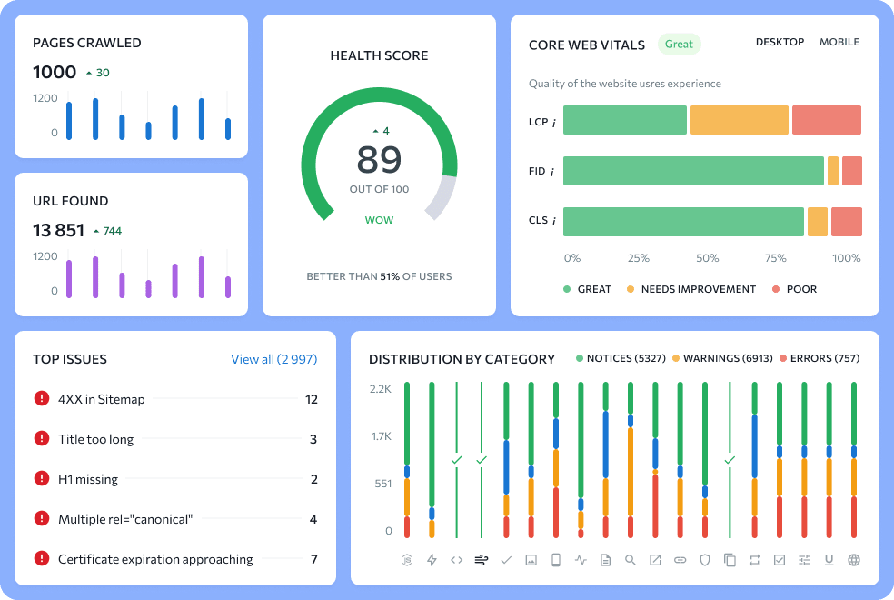
Find all technical issues on your website
Keep your website healthy by making technical checkups a regular habit.
Find all technical issues on your website
Keep your website healthy by making technical checkups a regular habit.
More tools for mobile SEO
- Go to the On-Page SEO Checker


Evaluate page optimization for mobile SERPs
Compare your page's SEO to top-ranking competitors on the mobile SERP.
- Go to the Website audit

Check website health
Check your entire website’s technical SEO and get a list of tips for fixing its crawling, UX and performance issues.
What is mobile-friendly testing?
Mobile-friendly testing verifies that the site looks good, is easy to use, and works well on mobile devices like smartphones, tablets, or e-readers. Specialized tools can perform these tests. These tools typically provide a grade or a pass/fail result, indicating what’s working well and where there’s room for improvement. They also come with a list of useful to-do recommendations.
How do I test websites for mobile friendliness?
You can either do it manually or use popular online tools. For manual checks, you should use multiple devices with different screen sizes and resolutions. This will give you a concrete understanding of how your website looks and functions across different devices.
You can also perform a mobile-friendliness check with popular online tools (e.g. this Mobile Friendly Checker).
What tool can I use to test my mobile website?
There are plenty of online tools and methods that check for mobile-friendliness. Here are some that we highly recommend:
- SE Ranking’s Mobile-Friendly Site Test: Designed as a Google Mobile Testing Tool alternative, our free checker shows you how mobile-friendly your site is based on crucial technical and usability aspects. It also offers improvement tips.
- Lighthouse: This tool evaluates your website for its performance, accessibility, SEO, and possession of progressive web app features. It offers detailed reports with key insights and practical improvement suggestions for your site’s mobile experience.
How do I make my website mobile-friendly?
Follow these tips to make your website mobile-friendly:
- Create a mobile version or use a responsive design that adapts to different devices.
- Use text that’s easy to read without zooming in, and buttons that are big and easy enough to tap.
- Optimize images and multimedia for faster mobile loading.
- Keep your menus and navigation simple.
- Test your site on various devices to ensure it runs well everywhere.
- Consider mobile-friendly plugins or optimization tools.