Big SE Ranking update: Welcome to a new era of SEO
Our huge 2020 update has been in the pipeline for a very long time, and we are now thrilled to say that it’s ready. We at SE Ranking have fully redesigned our SEO platform, have made it adaptive, and now nothing’s holding it back from giving our users everything they need at lightning speed.
As of today, you can switch over to the new interface and take the new and improved version of SE Ranking for a spin. Besides having a modern look, it’s got adaptive technologies under the hood and the dashboard’s packed with new metrics.
We have completely rewritten every single line of code so that SE Ranking could go from zero to full power in a matter of seconds—now every project, be it small or large, loads up in the blink of an eye. The new design has got a handy left-hand vertical navigation bar and adaptive data display so that you can get all the data you need on a single screen.
Practically every section of the platform got updated which is why we can confidently say that SE Ranking entered a new era. But don’t worry. All the tools and features you love are still there, only now they are much faster, more user-friendly, and are way more efficient.
We put together a video to demonstrate all of the big updates we made to the platform, so be sure to check it out!
Ready to find out everything about SE Ranking’s updates? Then let’s get to it!
Improved navigation and customizable dashboard
The first thing that catches your eye once the main dashboard loads up is the new modern design and improved navigation. All of your projects have been moved to the left-hand vertical navigation bar and the most popular tools can now be found in the horizontal navigation bar at the top: Competitor Research, Keyword Research, Backlink Checker, Report Builder.
Same as before, the main dashboard contains a summary on all of your projects, only now analyzing them is a lot easier.
All the statistics load up instantaneously, regardless of how many projects you have in your account—five or fifty. The graphs and charts have become more informative and understandable so that you could quickly read all the necessary data, even for long periods of time.
Thanks to the adaptive design, all metrics now fit on a single screen—all you have to do is minimize the navigation bar on the left-hand side. Doing so allows you to evaluate your projects’ promotional efforts at a glance. On top of that, you can now easily customize the main dashboard however you want. Every element can be moved around, plus you can play around with the appearance of the interface.
Rankings module: More workspace, chart and graph previews and updated notes
Just like before, you can access the Rankings module via the corresponding icon next to any project on the main dashboard. Alternatively, you can use the left-hand vertical navigation bar to hover over a project and access your website’s data on rankings, analytics & traffic, and competitors in a single click.
Like the rest of the updated platform, the Rankings module also sports the same adaptive design, boasts its loading speed and offers easy customization. By minimizing the navigation bar, you can use the entire working area of the screen to view keyword ranking dynamics for a whole week. And if you want to get a quick understanding of how your rankings jumped or dropped over time, you can use the new Dynamics metric.
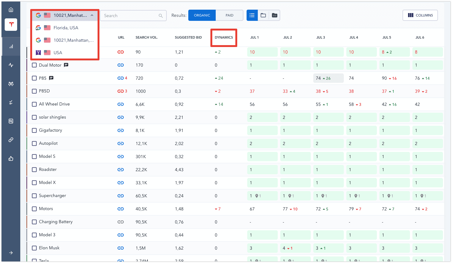
Want to check your keyword rankings in another search engine? Well, now you can switch search engines or regions in a single click, plus you don’t have to endlessly scroll through lists of keywords. Moreover, thanks to new technologies, data loads up super fast which is especially noticeable if you’re tracking thousands of keywords in your projects.
You can still view rankings for specific dates, apply filters, and sort data. As for updated elements, we improved the ranking filters. Now you can straight away see the percentage of keywords that are featured in the top 1, top 3, top 10 search results, and so on.
The module’s graphs and charts have been moved to the top half of the screen, giving you a small preview of each one without having to select it. This feature was developed to make it even easier for you to quickly react to any ranking fluctuations. So, if, for example, the search visibility chart suddenly plunges, you will definitely notice it.
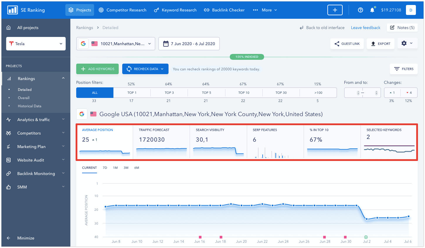
What’s really handy is that you can minimize the graphs and charts and just see their previews. That way, you’ll be able to see the full picture of your site’s rankings, including general metrics and specific keyword rankings.
Another global change is the completely redesigned Notes feature. Many of our users have asked us to make it possible to add notes directly to the charts and graphs, and we listened. You can now create notes for any section of the Rankings module.
Any event that’s significant in terms of your website’s SEO can now be recorded on every graph and chart. Got a backlink from a respected website? Updated content on a top-ranking web page? Create a note and never miss anything ever again. And if your ranking positions start going up or down, you’ll have a better understanding of the cause behind it.
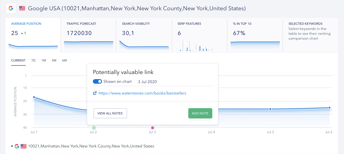
But that’s not all. Some of the notes will appear on the graphs and charts automatically. When you add new keywords to a project, the chart will display a plus sign (+) along with the total number of added keywords for that specific day. As I’m sure you know, targeting new keywords affects your average ranking position, search visibility and other indicators, but notes will help you understand what caused your graphs and charts to change.
Analytics & traffic module: All website traffic data in one interface
This module provides you with a comprehensive picture of your site’s traffic sources in a single interface. All you have to do to achieve this is link Google Search Console and Google Analytics to your SE Ranking project.
Of course, the design of the module has changed along with the interface. It has become adaptive, making every metric available on one screen. But one area of the module that got affected the most is the Google Search Console Data subsection. It is now packed with data. Besides seeing what keywords people clicked on to get to your website, you can also see what page they landed on, what device they used, in which country they’re located, and which featured snippet they responded to in the SERPs.
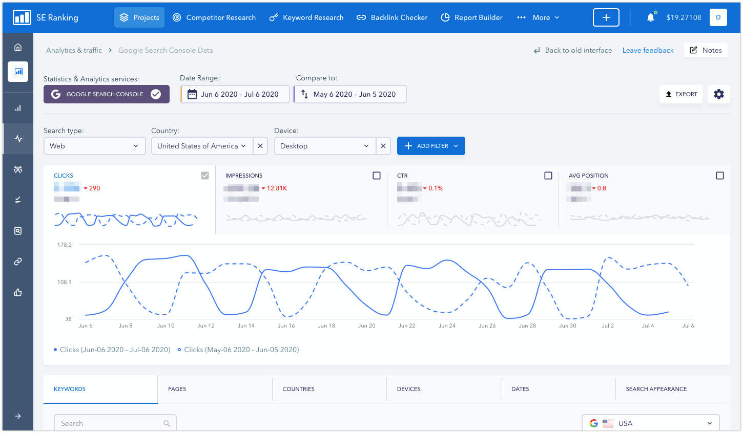
We’ve added a lot of filters to the module to make it even more convenient for you to work with data. You can apply several filters at once to a single chart and compare data for different periods.
In a word, all GSC data and more is now available to SE Ranking users which means you can forget about switching between different tools to get the data you need.
More data in the Backlink Monitoring module. A lot more.
Once you select a project, you can access the Backlink Monitoring module via the left-hand vertical navigation bar. Here you can keep track of the status of your website’s backlinks: make sure that none of them were deleted, and that the pages that link out to you can still be found on Google SERPs. With the updated interface, you can now minimize the left-hand navigation bar to see even more data.
We’ve also made it possible to group links in the updated tool, and added filters to simplify backlink analysis. You can immediately see how many domains link out to you, which pages they link out to, which anchor texts are used most often—if one of the pages is getting a lot more backlinks then this could be a sign that you ought to adjust your strategy. In addition, you can also see in which countries your referring domains are located (by IP addresses), and which backlinks are disavowed—as in, which backlinks Google does not take into account when indexing pages.
All the information provided under various backlink tabs is presented in the form of graphs and charts. For example, besides seeing the number of domains that point to your website, you can also see their dynamics, the ratio of domains that link out to the homepage and other pages of the site, and the distribution of donor sites by domain zones.
Plus, it’s also packed with all sorts of filters. You could, for example, select to view only active or lost backlinks. Or when analyzing backlink anchor texts, you could use the corresponding filters to ignore nofollow disavowed backlinks.
SEO/PPC Competitor Research is now a part of the main platform
SEO/PPC Competitor Research is an all-time user-favorite tool which is why we just had to make it accessible in a single click. The tool got its own slot in the top horizontal navigation bar and has thus become a part of the main platform. Why does this matter?
In the old design, if you wanted to see a competitor’s backlinks after analyzing the keywords they target, you had to return to the main dashboard. Now you can switch between tools quickly and without any hassle. If you use the White Label feature, we’ve got more good news for you. Having become a part of the platform, Competitor Research is now available for use under your own brand name.
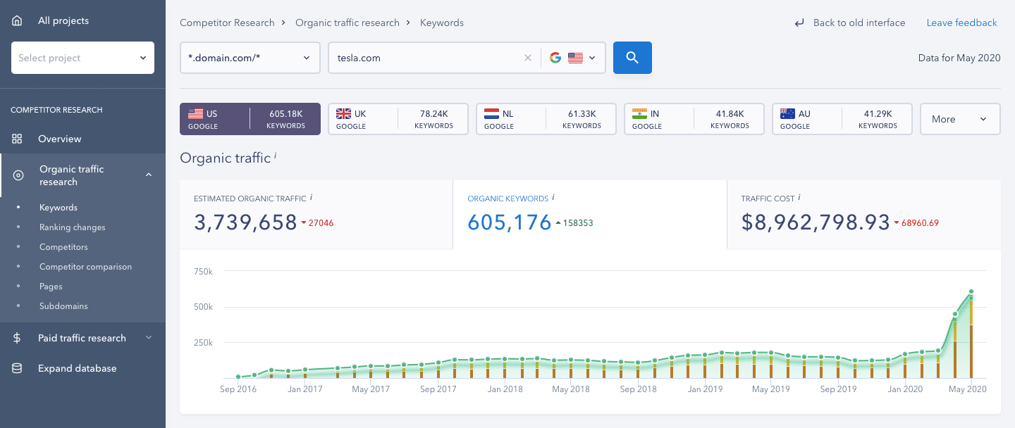
Finally, like every other SE Ranking tool, SEO/PPC Competitor Research boasts an updated design and an incredibly fast loading speed. Now all the information about your competitors’ organic and paid campaign efforts will be displayed in a matter of seconds.
New graphs and metrics in Keyword Research
We have completely reshaped this module, made it a separate tool and moved it to the top horizontal navigation bar—right next to Competitor Research. The tool’s interface has become much clearer and is now full of new elements.
When doing keyword research, you can immediately see any search query’s search volume dynamics, evaluate its seasonality, as well as see the cost per click for different geolocations. On top of that, you’ll also be able to immediately get an idea of how difficult it will be to get into the top 10 organic search results for any keyword thanks to the Keyword Difficulty score. This is a new metric that we developed to replace the obsolete Keyword Efficiency Index. With the help of it, you can assess how promising a keyword is, handpick keywords that will do a better job at driving traffic and get your pages to rank among Google’s top search results.
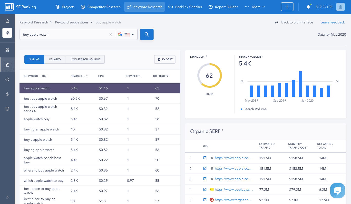
Analyzing similar and relevant keywords has become much more convenient in the updated tool. Now, having selected any keyword from the suggested list, you can immediately get additional data on it, such as its difficulty score, how its search volume trend has changed, and which competitors are ranked on page one of the SERPs.
Clickable metrics in Backlink Checker
This tool also got a place in the top navigation bar and is now always at hand. We’ve actually updated it not too long ago—added a bunch of new subsections and metrics so that you could objectively evaluate any site’s backlink profile.
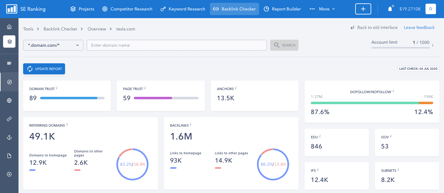
As for the changes that you just can’t miss—you guessed it, the updated design and convenient data layout. Furthermore, when analyzing metrics provided on the Overview tab. You can click on a parameter you’re interested in to see additional information. For example, by clicking on the number of anchor texts in a site’s backlink profile, you’ll automatically be redirected to the corresponding section of the tool.
And as always, stay tuned for more updates! But for now, switch on over to the new interface, try out all of the updated tools and be sure to share your feedback with us. And if you have questions, our support team will be happy to help.
